I have been using a few self-made Connect IQ apps on my Garmin Edge cycling computers for over a year now as it doesn’t take much to write a few lines and side-load them onto one’s Edge over USB to try out. Debugging is less convenient than, say, when developing a PC application in Visual Studio, but compared with the early days of Connect IQ it has become much more stable and enjoyable now.
One of my apps – the one above – has become my go-to data field for indoor rides. It helps me judge how hard I am pushing myself during a training session compared with my past performance providing motivation to go hard where meaningful – but also to go slow when recovery was needed. I do believe it helped me reach my goal of 2016 – a FTP of 4W/kg.
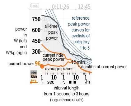
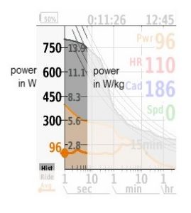
In short, it shows the Peak Power of the current ride from start until the current moment, together with all-time Peak Power and a graph of live average power values. To my knowledge, this is the first time this has been implemented in real time. A worlds first!
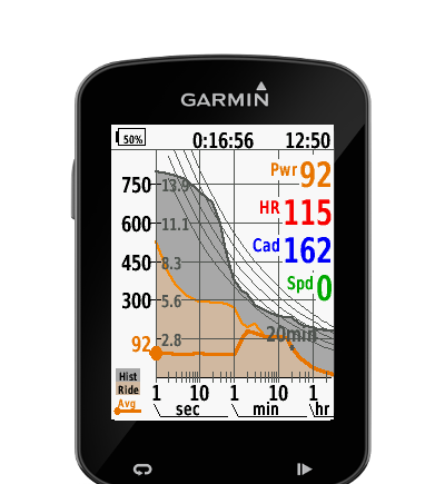
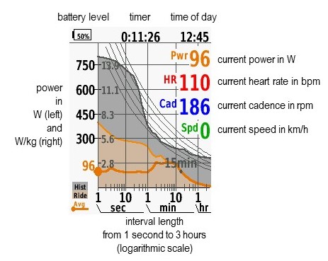
As this takes up all of the screen of the Edge 520/820, I have also added some of the other basic information onto the same screen.
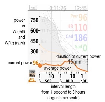
(Don’t ask me why in this screen shot speed is zero and cadence is an aggresive 186 rpm while I am putting out 96W: These screenshots were captured in the simulator software which allows convenient debugging on a PC, so no one was harmed by that cadence. Still, of course, you could ask Garmin why they think these values make sense – but maybe they thought it’s important to test especially those rare freak cases that should not occur?)
I’ve now put that data field on Garmin’s Connect IQ app store for anyone owning a Garmin Edge 520/820/1000 cycling computer to play with. As with most Connect IQ apps, it’s free for everyone to download and use. The concept behind it, namely displaying and using Peak Power live while riding isn’t common – yet – and possibly slightly more mathematical than the general public would appreciate, so, here are some simple explanations of the thoughts behind it and a few hints about how to use it.
Peak Power
Peak Power (sometimes also called Maximum Average Power or Maximum Mean Power – note that average and mean have slightly different definitions in mathematics and if I had to choose now I’d vote for the former) is the largest average power for some specified interval duration. For example, if you take all possible 20 second intervals of a ride, i.e. from 1s to 20s, 2s to 21s, 3s to 22s, etc, calculate the average power of each, and then take the largest of those, that number is the 20 second Peak Power of that ride. If you are interested in your sprint capabilities, you’ll look at short duration peak power; if you are interested in your endurance, Peak Power over longer durations will give you some guidance.
One well known example actually is Functional Threshold Power (FTP), which is not an invention but simply a naming for 60 minutes Peak Power. If is often approximated by multiplying your 8 minutes or 20 minutes Peak Power with some constant to correct for the fact that you would be stronger for such short intervals on the assumption that that constant would be same for all cyclists.
It is sometimes useful to look at the long term changes of some specific Peak Power to capture a hint of long term trends.
The Peak Power Graph
If you calculate Peak Power for all past rides for all possible intervals from 1s up to, say, 1 hour, and plot them on a graph where the horizontal axis starts from 1s on the left and goes up to the longest interval on the right, the Peak Power will form a decreasing curve.
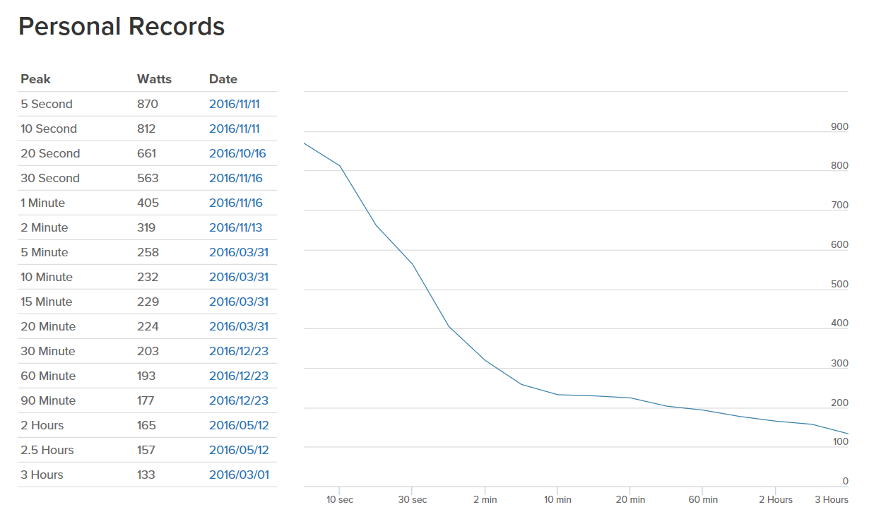
The Peak Power graph shows a lot more information than a single Peak Power value as it allows to judge, for example, what your specific strengths are, whether you are more a sprinter or an endurance athlete, whether you should add strength training or longer rides, whether you are making progress in what you are currently targeting, etc.
Of course it does not show everything. For example, this graph does not show how fast you recover from an effort and how often you can complete an interval before exhaustion. There is also not one absolute truth about how a Peak Power curve of, say, a sprinter should look like, but Velo magazine from August 2015 for example suggests these examples.
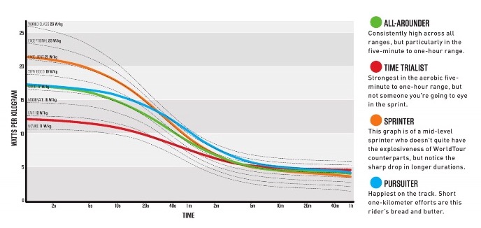
Another way to look at the Peak Power graph could be to divide the interval lengths into zones depending on the dominant metabolism, i.e. the main physiological systems contributing (or limiting) the effort, of the three metabolic energy pathways:
- The phosphagen system that regenerates ATP (adenosine triphosphate), the energy source of all physical activity, from stored CP (creatine phosphate) without using either carbohydrates nor fat.
- Gycolysis, which converts carbohydrates from either blood glucose (sugar) or muscle glycogen (stored in muscles). In the presence of enough oxygen (aerobic), an intermediate product called acetyl coenzyme A will be further processed in to more ATP, but if oxygen supply is insufficient (anaerobic), it will be converted into lactate.
- The Aerobic System uses everything, blood glucose, glycogen and fat as fuels and is most efficient (producing 18 times more ATP from each glucose molecule than anaerobic glycolysis) but is the slowest.
These three – or four if we divide Glycolysis into anaerobic and aerobic – roughly map to interval duration as follows:
- 5 to 10 seconds: Neuromuscular – Phosphagen system.
- 30 seconds to 2 minutes: Anaerobic Capacity – Anaerobic glycolysis.
- 3 to 8 minutes: VO2 max – Aerobic and anaerobic glycolysis.
- above 10 minutes: Endurance – Aerobic system.
These mappings are obviously just rough guidelines and neither clear cut nor exactly same across individuals. Still, when I look at my peak power data in comparison with other cyclists – more about those comparisons later on – anaerobic glycolysis seems to be a weakpoint of me while the other system are average. And anaerobic capacity is known to decrease faster than aerobic with age, so, while this could be simply due to age, I also should do something against this.
The results of my last test of the respiratory exchange ratio (or RER) in which one cycles on a trainer in a step protocol with a mask connected to an apparatus that measures the amount of oxygen consumed and carbodioxide generated paint a slightly different picture. I found out that I already have a high RER of about 0.9 at rest which increases to about 1.0 between 50% and 120% FTP and then further to about 1.1 above 130% FTP, coinciding with a generally high level of lactate. From the chemical equations corresponding to the chemical reactions we learn that RER would be close to 0.7 for purely burning fat and 1.0 for purely burning carbohydrates, so, in my personal case, the Aerobic system is rarely really dominant.
The beauty of the Peak Power curve I think lies in the fact that it shows the pure data without all those assumptions and interpretations that are based on generalization that might or might not apply to you. It’s also free of rules of thumb that might have just accidentally survived. Of course it’s not omnipotent – it does not show everything. For example, this graph does not show how fast you recover from an effort and how often you can complete an interval before exhaustion.
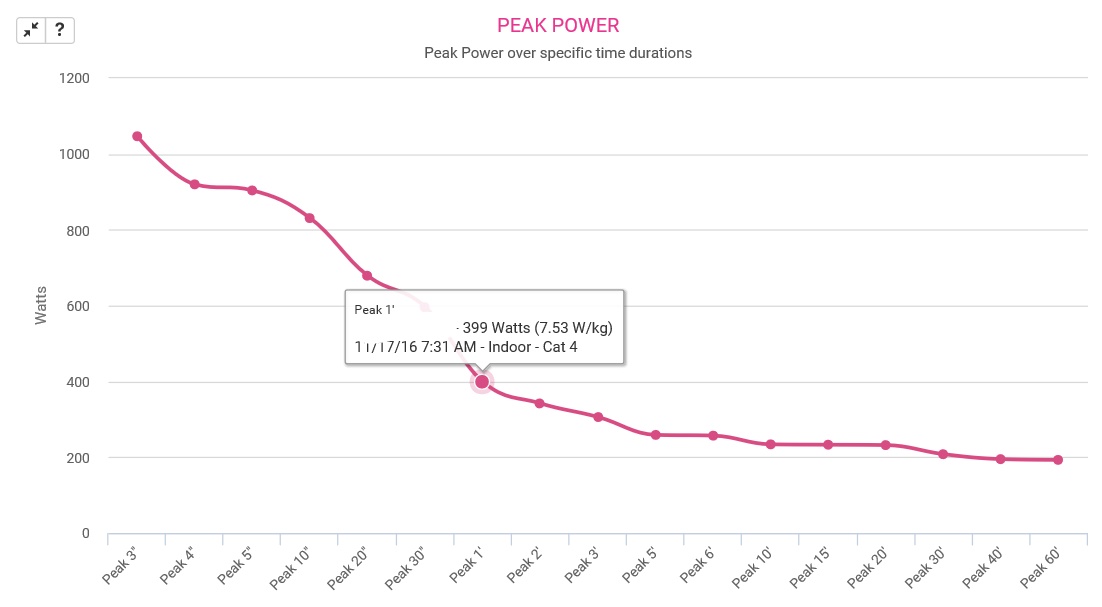
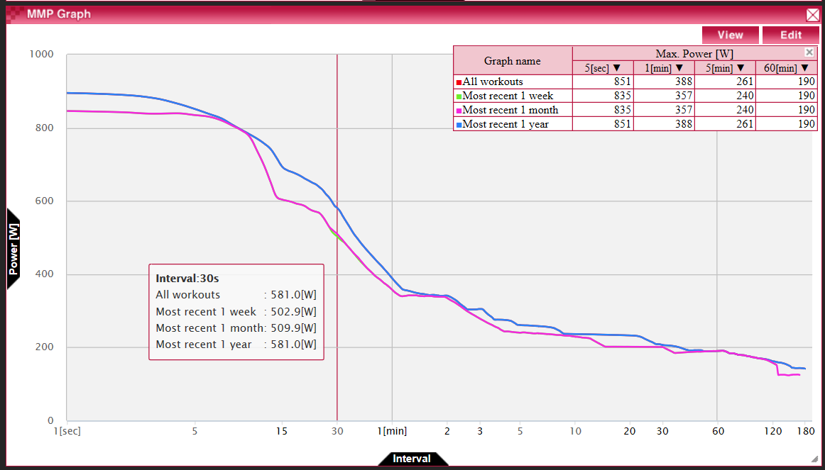
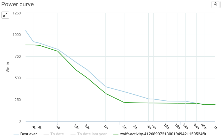
Peak Power of a training ride – for post-ride analysis
Some tools visualize the Peak Power of a training ride – after completing and uploading the ride data – in comparison to all-time Peak Power. This can be useful to judge how good you have performed in the last training session, whether you have indeed pushed yourself to your limit or even bested a personal record – or whether you sucked. Or may be it was just a tame regeneration ride.
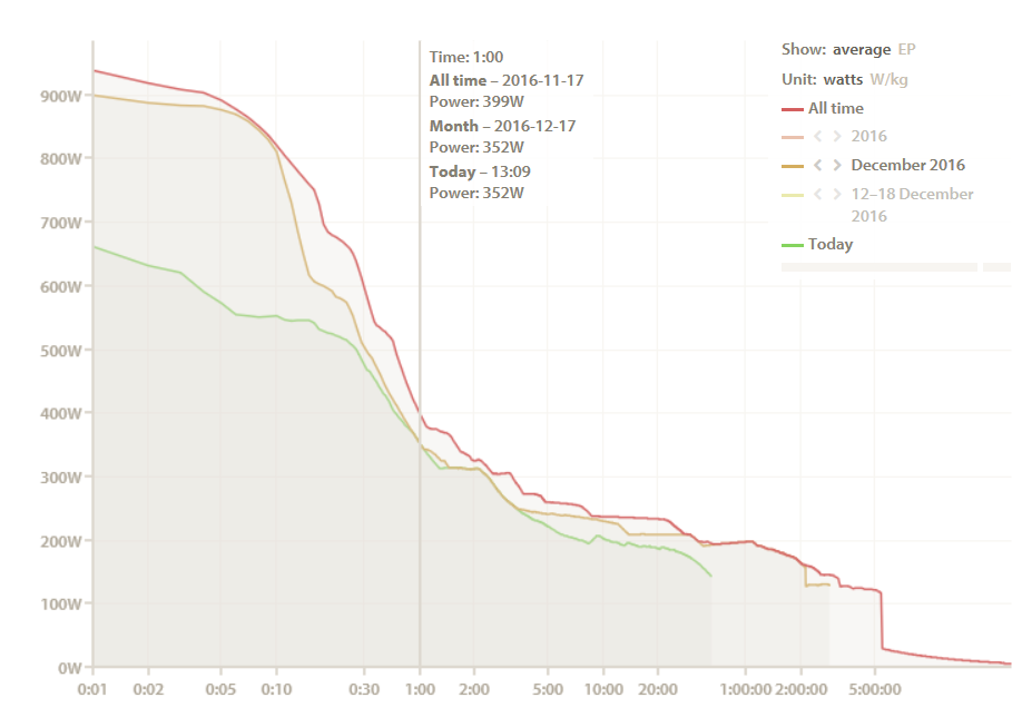
Live Peak Power of current ride
If the Peak Power of the current ride could be visualized while riding and in comparison to all-time Peak Power, it could be used not only for post-ride analysis but to adjust the riding immediately.
How did I perform in my last sprint? Did I achieve a new personal record? Or do I need to try harder? May be even give up and re-aim this ride as a regeneration ride? How was the new warm-up protocol I tried today? Did it allow me to perform better already, or should I add a few minutes of warming up at low power?
After a while of thinking, I found an algorithm to implement the calculations in a way that would fit even into the somewhat arbitrary 28KB limit that Garmin has for Edge 520 data fields and that would run in realtime even with the limited computing power of that device. It does sometimes skip a refresh cycle and not update every second, may consume more battery power than other data fields and sporadically fail to start at all, but overall it seems to work: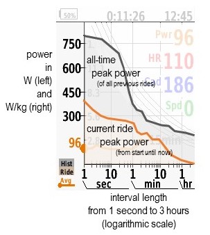
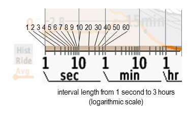
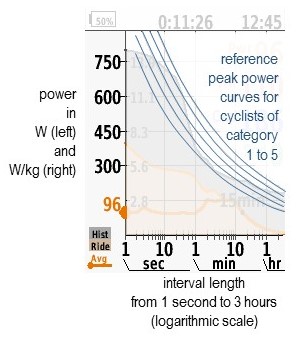
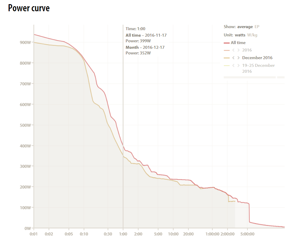
The horizontal axis is the length of the interval from 1 second up to 3 hours. It’s an logarithmic scale as is common with Peak Power graphs, meaning that the resolution is higher for short durations – e.g. 1 second increments below 10 seconds – than for long durations – e.g. 1 hour increments above 1 hour, so that you can see details where needed but also have an overview of the long tail.
 The vertical axis is a normal linear scale, again as usual with Peak Power graphs. On the left, power is given in W, on the right, power-to-weight ratio is given in W/kg. For this to work, your body weight has to be set correctly in your rider profile.
I also noticed that I should make it clear when I improved a personal record, so I decided to color the area between the previous all-time record and the new record in red, as shown here:
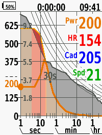
That area can be rather small and difficult to notive if the improvement is, say, 10W out of 1000W or 1%, so I have now changed the app (V0.3.30 from Feb. 1st, 2017) and added coloring of the area below the all-time record (in light red) as well, as shown in this screenshot. This coloring works in two steps to indicate if you are close to a new record by changing the coloring from beige to light orange at 90% of the all time peak before changing to light red at 100%.
Graph of Power Averages
As soon as I started using an earlier version of this data field showing my current as well as all-time Peak Power, I noticed that there was something missing. What is my current performance compared with the current Peak Power? Am I on my way to improve on a personal record or should I bail out? How long have I been maintaining the current power level – both when pushing hard but also to judge when to end a refresh break between hard intervals?
I found that many of these questions could be answered by adding a curve showing average power values for all interval durations. On the left, it would start with the current instant power, which is the average for 1 second, and continue rightwards to the 2 second average, 3 second average, and so on, until the 3 hour average on the right end of the graph. Whenever this curve overlaps with the Peak Power of the current ride, it would mean that you are currently riding at the Peak Power of the current ride and about to improve that section of the Current Ride Peak Power if you push a little bit more. If you are far below the Peak Power of the current ride, you will need to build some momentum first before having a shot at improving the Current Ride Peak Power.
Statistical reference curves for Peak Power
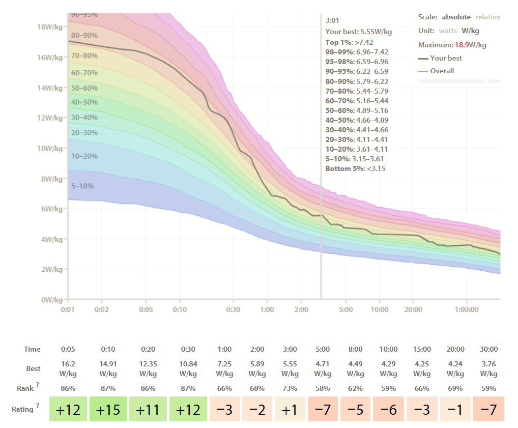
Looking just at your own Peak Power might be useful, but wouldn’t it be even nicer if one could also compare with others? Cyclinganalytics provides a nice rainbow colored graph to judge where one stands in comparison to all other Cyclinganalytics users.
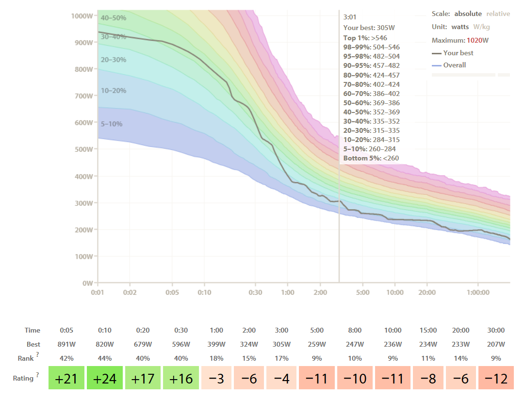
The gray line shows my peak power while the rainbow shows the zone of all other users from bottom (in blue) to top (in red). So, this graph is showing that I am pretty average for short durations … and suck for any interval longer than a minute … if we compare by raw, absolute power. While absolute power is significant for speed when riding on flat roads, it also is a measure at which heavier riders fare much better than light weight riders like myself and even better than they’d do on a real flat road. When going uphill, the power-to-weight-ratio makes more sense as a performance measure as that is the physical metric that determines climbing speed – even though one could argue that that disproportionately favours lighter riders. Still I believe that power-to-weight ratio is the somewhat “fairer” way to compare athletes of different body size. The power-to-weight statistics for is significantly more favourable for me, as I now seem to be pretty average for all durations above a minute and slightly – or even significantly better between 10 and 30 seconds.
Instead of using actual statistical data of a large population, I turned to a famous table that’s also often quoted on the internet and looked up reference data about typical relative Peak Power for cyclists racing in Categories 1 to 5 and created some approximation curves to fill in the gaps. Obviously, these are very rough reference guides as there will be a lot of differences between riders in the same category and there really is no typical Category X cyclist. And of course these curves do not change the fact that peak power does not capture how quick one regenerates from an effort and becomes ready for the next break away. Still, I found these reference lines very useful, both to provide motivation to improve my relative weaknesses (from around 1 to 3 minutes) but also to further enhance my relative strengths (like between 10 and 30 seconds). The app will read from your profile settings whether you are male or female in order to adjust the reference curves. (I admit the approximation does not adequately model the flattening of the curve at very short durations – this could be improved later.)
App configuration
It would be really nice if this app didn’t require any configuration. In some way it doesn’t: if you do all rides with it, it will update the historical Peak Power curve after every personal record and require no configuration except for setting your body weight in your user profile.
But if you have just started using this app, it will take some time until the historical Peak Power curve becomes useful, and in the long run, you’ll probably do some rides without it even if you became a big fan of it. It would be nice if you could just connect it to the data accumulation site you are using and let the data field download all data via a connected smartphone – unluckily Garmin does not allow data fields to do that, and I am still divided whether to turn this from a data field which is easier to use within your training screens into an app.
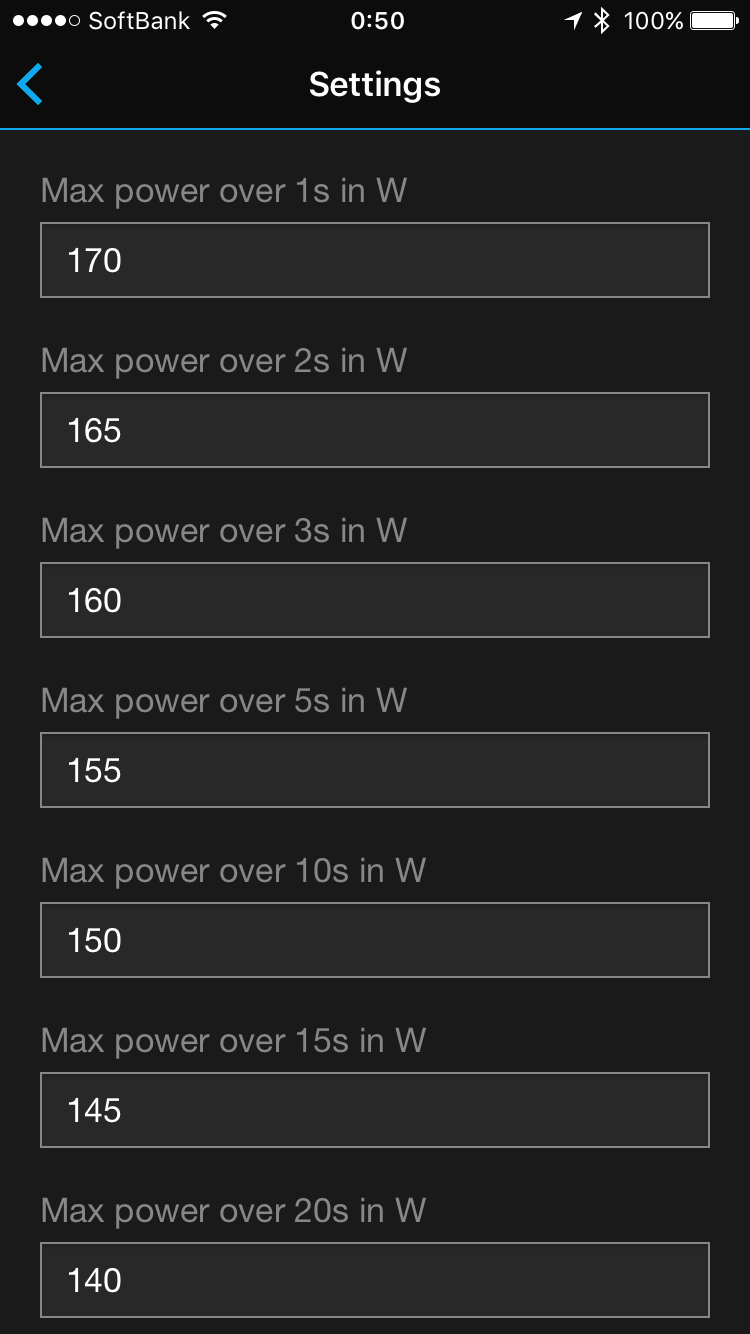
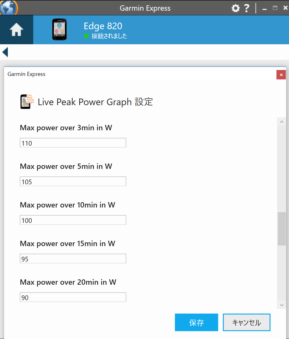
The current solution is to use the settings screen in either your Garmin Connect App on your smartphone or Garmin Express app on your Mac/PC, to write or read the currently set values of your historical Peak Power. It requires 25 numbers in total, one each for 1-2-3-5-10-15-20-30-40-60-90 seconds and 2-3-5-10-15-20-30-40-60-80-100-120-150-180 minutes. You should be able to get most of those numbers from your TrainingPeaks, TrainerRoad, Cyclo-Sphere, Today’s Plan or Strava Premium account pages or Golden Cheetah – or whatever else you are using. Please approximate if your source does not supply data for some of the intervals this app is using. Note: Depending on the sleep settings of your Edge, it might enter sleep mode before you have finished typing all 25 numbers and saved, in which case you might lose your effort. So I recommend to save once half way through.
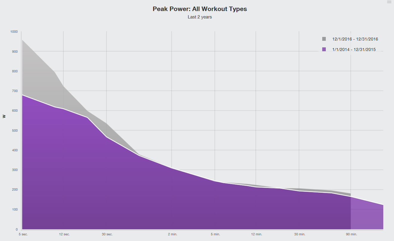
Peak power graph of a time period
Many sites also allow comparing all time Peak Power with Peak Power of some time period, like the most recent month or year, in order to judge how you are trending. I don’t think I haven’t seen any site offering comparison with the same month of the previous year, which is a standard comparison in economics to look at yearly differences for something with a seasonal bias and could be useful to cylists too who structure their training with on- and off-seasons over the duration of a year.
I have not yet found a way to implement such in a data field, due to memory limitations for the Edge 520 and Garmin not allowing internet communication over connected smartphones for data fields. It might be possible if I turned this data field into an app – may be sometime in the future.
Notes
Peak Power curves usually monotonically decrease – that’s the mathematical terminology for a curve that is either horizontal or sloping downwards to the right – with increasing interval duration but, a bit surprisingly, they don’t have to. Consider the weird but not impossible sequence 0W, 100W, 0W, 100W, 0W. Peak Power for 1s, 2s and 3s are 100W, 50W (average of 0W, 100W or 100W, 0W) and 66W (average of 100W, 0W, 100W) respectively with an increase from 2s to 3s.
The discontinued Pioneer SGX-CA900 cycling computer had a CP curve display but without the curve of averages which, I believe, really transforms these curves from a more post-ride analysis visualization to a tangible, actionable, real time display that reacts instantly to the way you ride and enables you to adjust.
I am not a big fan of using FTP. Being just one number it is about as simple as it may get and I myself use it when I set rough annual goals – because annual goals should be rough and leave room for correction. The FTP value alone does not say much – two cyclists with same FTP might perform very differently at 80% FTP or 120% or even at 105% FTP. Many cyclists will not be able to complete an hour at the FTP that was calculated from a 8 or 20 minute interval, while others might totally exceed. When FTP was proposed, which was pretty much still in an analog world, it may hit a good balance between complexity and modeling accuracy. But now in the age of big data analysis I think it’s about time to replace FTP by something more complex but also more scientific. Some might even go as far as saying that all the zones calculated in percentages from FTP and structured training programs that are scaled by a single FTP multiplier are nonsense.
I have also tried W’ which aims to model fatigue. As useful it would be to be able to calculate time to exhaustion or number of matches burned, this again is overly simplified and, in my experience, pretty much useless as the model does not mostly not fit whatever the choice of the – just – two parameters and without the ability to incorporate daily condition.
One might think that using live physiological data to generate and continuously correct a more complex model might be a solution. Unluckily it seems the human body is very complicated and the data we can measure is still very limited. Of what value is the easily measurable heartrate for an exact mathematical model of the cardiac output – which is what we are really interested in – without the much more difficult to measure stroke volume? I have been told that as a rule of thumb, SV is constant over a large part of the heart rate range and the linear HR-CO relationship only deteriorates at very low and very high heart rate – still, how low, how high and how constant are those limits for me? As informative as it is to use physiological measures and learn about the body, it seems we are still years away from being able to capture a sufficiently complete picture.
This app is my attempt to visualize that what we know – minus power meter accuracy – instead of hopeful and often practical but in the end illusionary ideas of what we hope we know but in reality do not. Of course this means that you have to do the interpretation yourself and you will need some experience with that. On the other hand, grasping relations and interpreting is something that the human brain might actually be good at. In the past year I think this data field has served me well to get a better understanding for average and Peak Power, both intuitively and consciously, which helped me to reach the training goal I was going after.
I should note that I do not recommend pushing yourself to your limit too frequently, even if you now have a tool that makes it easy to do so. Running marathons in your daily training would wear you down pretty quickly, like, in one day – chasing down personal records every day can be fun but is likely more stressing than is useful. In the extreme case, there have even been reports of athletes who had to give up sports due to scar tissue in their heart muscles likely caused by repeated overreaching and there is some speculation that the never seen before prevalence of cardio training could lead to a severely damaged, overstrained, unhealthy elderly population in the near future. My wish is that this app help making better decisions, and that should not always mean going to your limit.
But of course, it can be a huge motivator to best some of your records – of which there are plenty if you have the whole Peak Power curve from one second to three hours at your disposal – every few weeks, and one possible use of this data field is to judge whether today is the day to go for it.