Power meter output variation between rides

Of course, power meter output for the same input power should not vary between rides. But how would anyone check without having access to a calibrated pedaling robot?

One-on-one comparisons between different power meters are always difficult to interpret. They might perfectly match (which they usually won’t) and you’d still not know whether they are right. More often, they will differ and you won’t know which one is off by how much, just that at least one of them must be off.

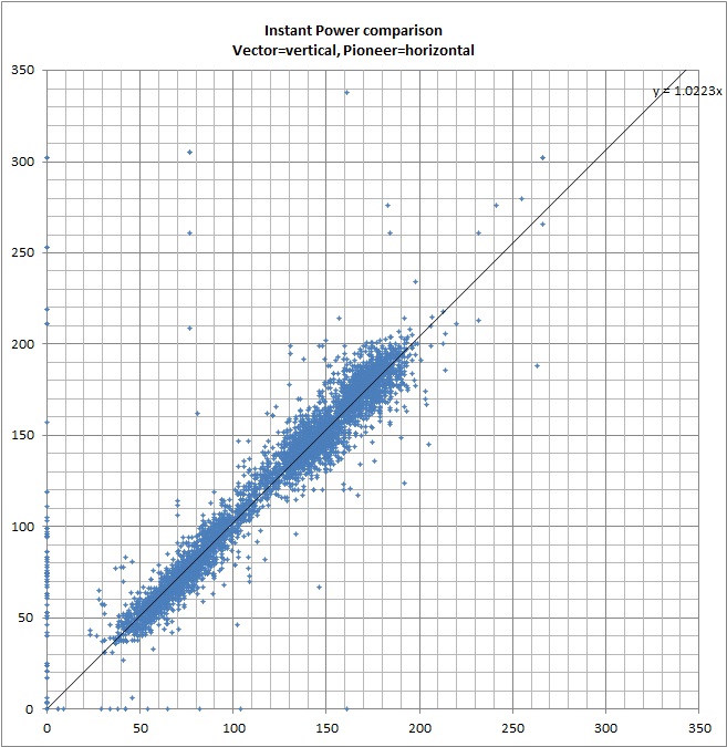
Using scatter plots as described in an earlier post

variation between rides - scatter plot sample - total

we can use linear approximation to get a single value describing the difference between two power meters. We can also do the same for left and right pedals each, although, keep in mind that spider-based meters like the P2M (or hub-based meters) will only provide an estimate.

variation between rides - scatter plot sample - left variation between rides - scatter plot sample - right

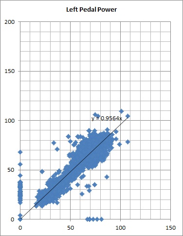
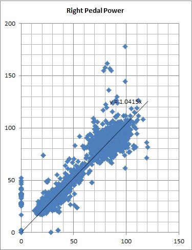
The inclination of the linear approximation is not a 100% statistically correct way of comparison here; there are issues like whether zero-points should be left out, whether the approximation should go through the origin of the axes, whether it should be linear etc, BUT, it provides a way to look at the overall trend.

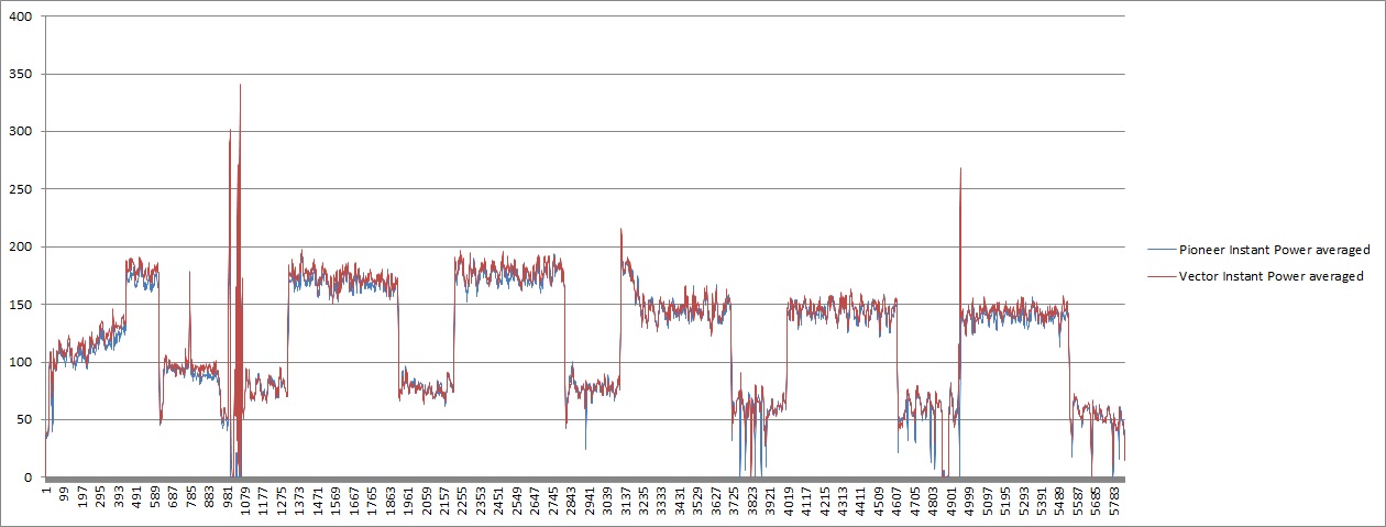
I collected the data over several rides, some of which were taken on the same day, each ride starting with a zero-offset calibration of both meters and got this:

variation between rides - vector vs pioneer

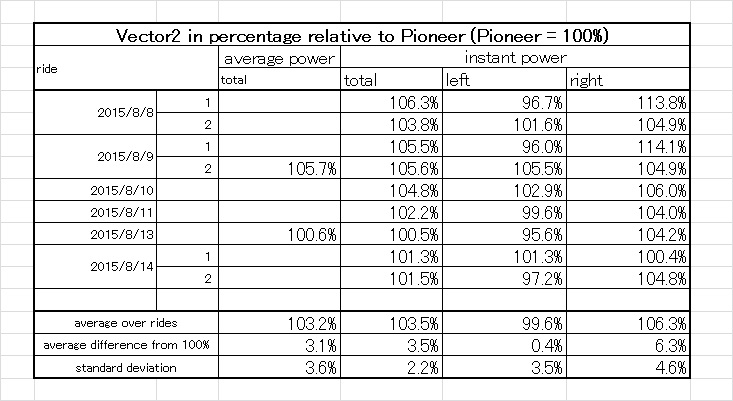
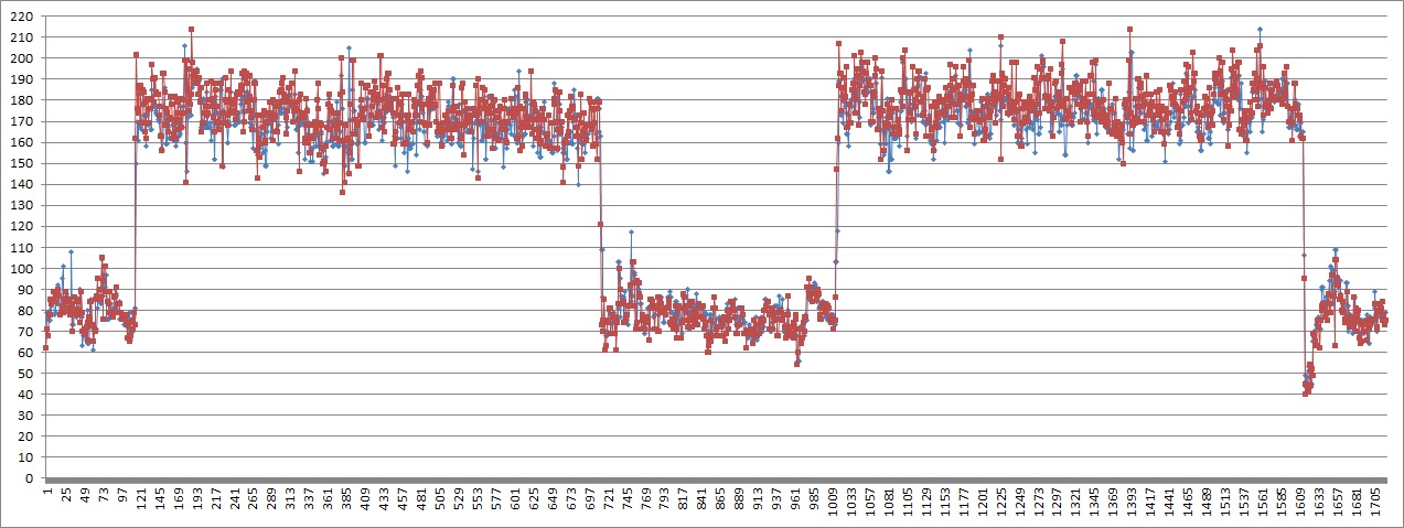
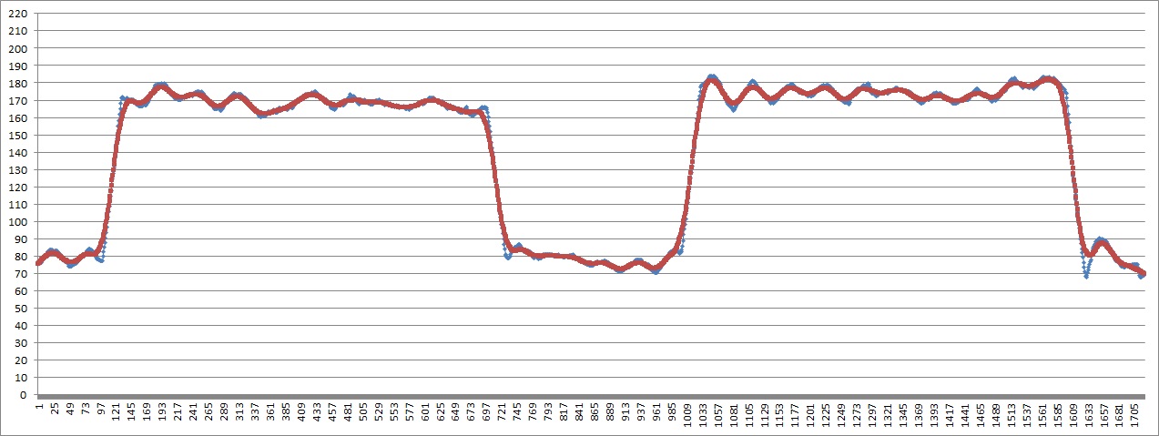
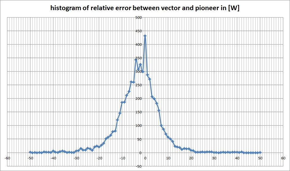
The total instant power of both meters differs on averageby 3.5%, which could be within the manufacturers claims. The fact that it may differ by up to 6.4% is less so, especially considering that this data was taken in a climatized indoor environment without large temperature changes. Both meters measure left power and right power independently: The left meters match almost perfectly by a difference of only 0.4% on average, although s.d. is a bit larger; the right meters agree less and differ by 6.3% on average and 14.1% maximum (note though that after both rides differing by more than 10% the second ride agreed much more, which might show some kind of conversion, though, the left side is showing the opposite trend… ). Although both meters report different values for instant and average power, their comparison result is similar.

variation between rides - vector vs p2m

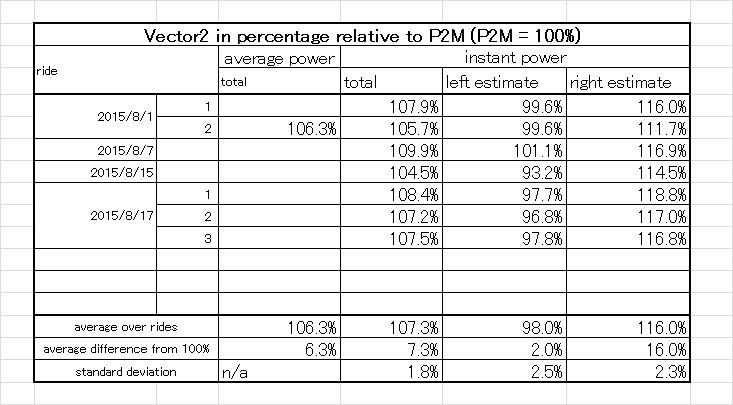
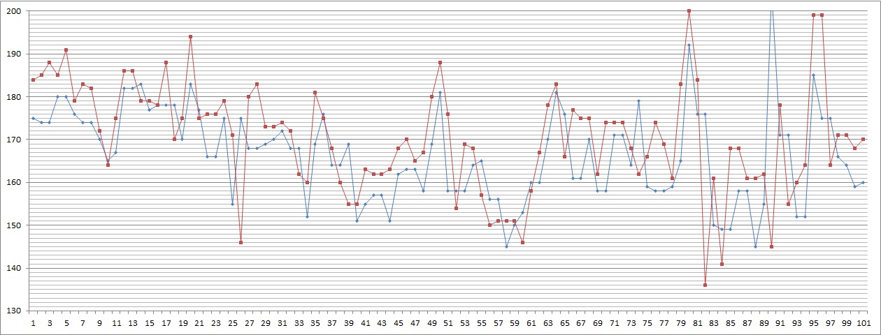
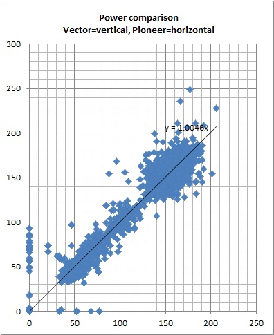
Comparison of Vector2 and P2M shows that, for total power, the variance between rides is slightly less than in the previous comparison, although the difference is slightly larger, 7.3% on average, the Vector2 always reading 4.5 or more percent higher, which is not nice. We also see that the estimated left/right balance is pretty stable over rides, although that doesn’t have to mean anything. We also see that, while the left vector pedal matches almost perfectly, the right vector pedal is again reading a higher power value than the power meter it is compared with.

Conclusion:

Even calibrating immediately before a ride will not eliminate bias beween power meters. A difference of up to about 5% doesn’t seem unusual, at least for the compared pairs.

The right Vector pedal used in this comparison reads to high compared with both the Pioneer and the P2M. Note that the Vector had been calibrated using a known weight just days before, and the right Vector was scaled to about 98% of its original output value. I may need to talk with their support about this issue.

How precise are Power meters?

In statistics, precision refers to repeatability, meaning that something is precise if all measured values are close to each other, while accuracy is exactness, meaning that the average of all measured values is close to the correct value. So, a power meter can be accurate and precise (the ideal case), precise but not accurate (useful for day to day training, but not comparable with other meters), accurate but not precise (average values are correct, but a single sampled value can be far off), or neither accurate nor precise.

Obviously, an accurate and precise power meter would be nice to have, but it’s also pretty well known by now that power meter values can dance a lot, and many riders display 3 or 5 or even 10 second averages on their cycling computers.

So, how precise are power meters?

Let’s look at this ride, comparing Pioneer ang Garmin power meters. As usual, this is just a single one-to-one comparison ride, so, I am not saying this data is representative for power meters in general or these two power meter models in particular, it’s just what I got. And, if you’d ask me which one is correct, I’d of course say: neither one.long ride comparison - average - complete ride

If we zoom in, we get something like this:

long ride comparison - instant - two intervals

Large changes in power obviously correpond, but small changes look pretty chaotic. Averaging over, say, 30 seconds eliminates all small changes and we get this:

long ride comparison - average - two intervals

So, both meters follow each other pretty well, and the pioneer is a bit slower to respond to large changes, but then tries to correct itself by a steeper slope. (Overshoot is pretty well controlled, although we see one at the last decline.)

But, this isn’t really satisfying: If I buy a kitchen scale for which the manufacturer is stating an accuracy of plus minus 1g for any weight below 100g, I expect 95% of all measurements to fall within the stated error range. Aren’t we making it too easy for power meter manufacturers when we let them get away with a simple accuracy statement (that’s also difficult to check) without any promises about precision?

So, what can be done with data that looks like this:

long ride comparison - instant - 1500 to 1600

One thing to try is a scatter plot where every data point is visualized by a single plotted dot, here with Vector on the x-axis and Pioneer on the y-axis.

long ride comparison - instant - scatter plot 2

The dots on the left on the y-axis show that the pioneer has more zero values which might be caused by measurement or transmission errors. The linear approximate y=1.0223x shows that on average the vector output is about 2% higher than the pioneer. Of course, one has to be careful with these plots because different time delays and a non-symmetric ride profile could bias this data. On the other hand, if the relative delay time difference is constant, one could simply shift the data set and try out several delay time combinations to find the most likely delay time.

We also see that the blue dot’s don’t line up neatly on the linear approximate line, but create a blue belt about 20W in width …. that’s a lot. So, let’s look at the width of this distribution in more detail, just keep in mind that this is not the error histogram of a single power meter compared with a correct value, but the relative difference of two power meters, containing the error of both (including the possibility that they cancel each other out sometimes).

long ride comparison - instant - histogram of error between meters in W

I am actually surprised that the peak comes at zero difference between the meters and a lot of values fall between plus minus 5W from zero. If we re-format this into a cumulative histogram, we get:

long ride comparison - instant - cumulative histogram of absolute error between meters in W

About 50% of the values fall within a plus minus 5W range, standard deviation is about 7W, 95% (or 2 s.d.) is about 18W and 99.7% (or 3 s.d.) is about 40W. So, from a statistical point of view, it’s pretty much nonsense to display instant power on your power meter.

I really think we need to have power meter manufacturers state how precise their meters are or have some independent organization check them with a calibrated pedaling robot.