What (I think) the Pioneer power meter tells me about my pedaling

Why look at pedaling data? Short term cycling performance – excluding long term training effects for now – is, in my understanding, about:

  1. Physiological efficiency in generating muscular force that works on the contact points – pedals, handlebar, saddle – with the least short term side effects like fatigue. As there are different pathways to generate muscular force – like burning fat or carbs – this includes finding the most efficient combination of fuels to sustain the targeted output over the targeted duration.
  2. Effectiveness of how you apply that muscular force and your body mass to turn the cranks. Tangential force on the cranks is effective and results in rotation but radial force does not. Pulling at the handlebar as a counterforce to increase your pressure on the pedals contributes to crank rotation but gripping the handlebar strongly does not. Body mass can be utilized rather statically as downward gravity or more dynamically as an inertial force to keep the cranks spinning at high cadence.
  3. Mechanical efficiency in turning the crank rotation into forward or uphill motion with the least amount of friction. Here, friction includes mechanical losses in the drivetrain, rolling resitance of the tyres and shifting air out of your way. If your ride goes downhill, you might include how to brake as little and keep as much momentum as possible.

The second item undeniably includes pedaling technique. But is it trainable? And, does pedaling data available on some power meters provide actionable information? It may not provide immediate answers but I think it provides a lot of food for thought.

There are a few different ways to graphically visualize pedaling and a few different ways to condense the characteristics into single numbers.

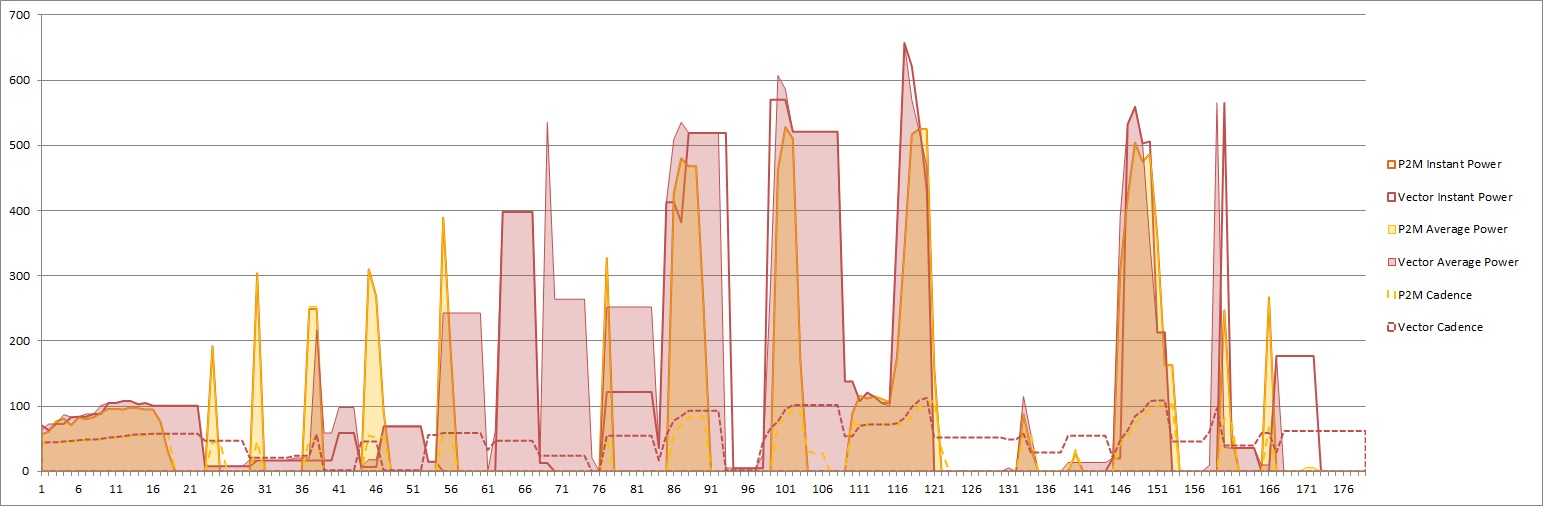
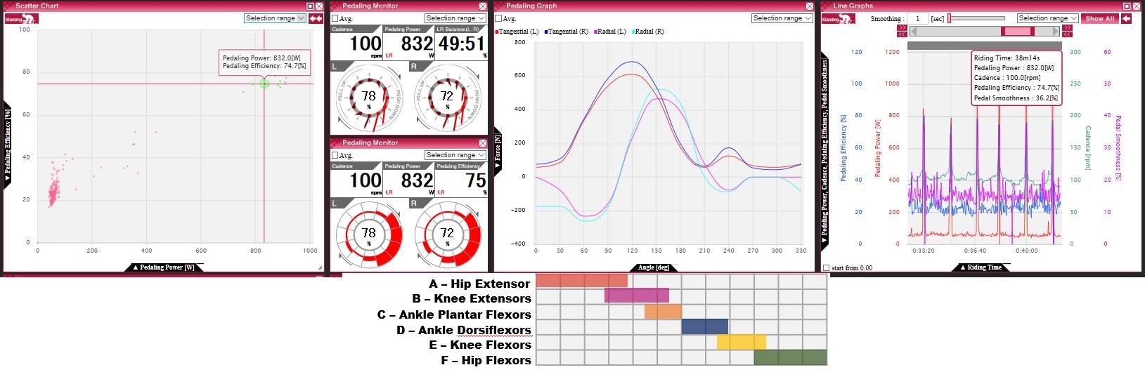
These are ride averages from a recent endurance climb on the Fuji-Subaru-line tollroad which leads halfway up on Mt.Fuji, Japan, and is the stage for an yearly hillclimb race with almost ten-thousand (!) participants. While the numbers – cadence, power, balance – should require no explanation, the graphs might be new to you. The left column shows average for seated pedaling while the right shows standing. The vectors in the graphs at the top show the direction and amount of the applied force at each of 12 crank angles whereas the botom graphs shows the amount of tangential force on the cranks, useful for judging for example where you had your peak (here it’s around 3 o’clock for sitting and 4 o’clock for standing) or where the forward rotational force (red) turned into counteracting resistance (blue) . There is also a left-right unbalance in the location of the peak when standing (later on the right). The percentage number in the center of the graphs is what pioneer calls “pedaling efficiency” defined as the ratio between tangential force and the sum of tangential and rotational force averaged over whole crank rotations.  It would be 100% if the force vectors are perfectly tangential but does not require the amount of the force to be constant over the whole rotation.

Out of the advanced pedaling metrices available on cycling computers, this one makes most sense to me as a quantification of the effectiveness of using body weight and muscular force to turn the cranks. Pedaling smoothness defined as the ratio of maximum tangential power to average tangential power – which is a crude way to express smoothness by the way – is probably pointless as it ignores that human biomechanics makes downward pushing easier than pulling up. Torque effectiveness defined as the ratio of forward power against total power is slightly more meaningful but often reaches 100% at which point further improvements cannot be quantified. My only criticism with Pioneer’s pedaling efficiency is that it’s actually not measuring efficiency but effectiveness and should therefore be called “pedaling effectiveness” and not “pedaling efficiency”.

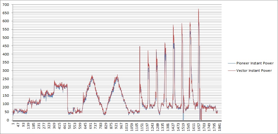
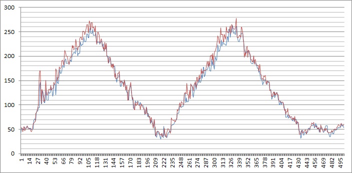
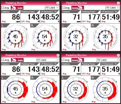
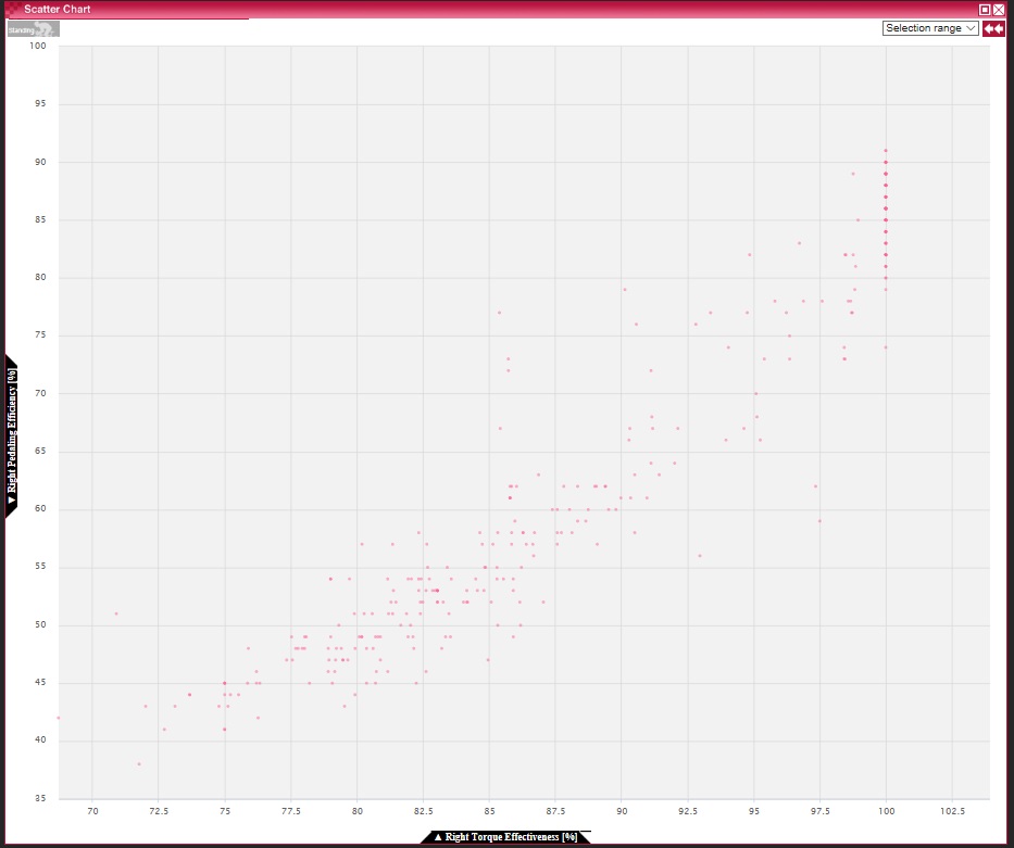
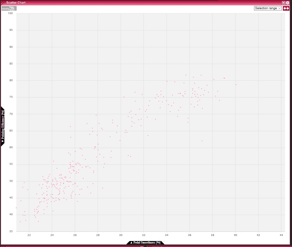
That said, those three metrices are mostly correlated as visible in the following graphs:

Pedaling efficiency, torque effectiveness and pedaling smoothness vs time
Pedaling efficiency vs torque effectiveness (left leg)
Pedaling efficiency vs torque effectiveness (right leg – TE saturates at 100%)
Pedaling efficiency vs pedaling smoothness (left right average)

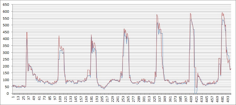
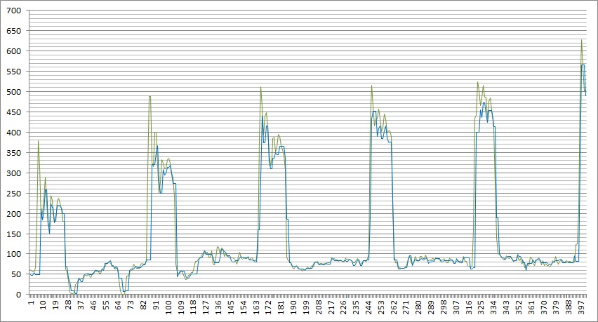
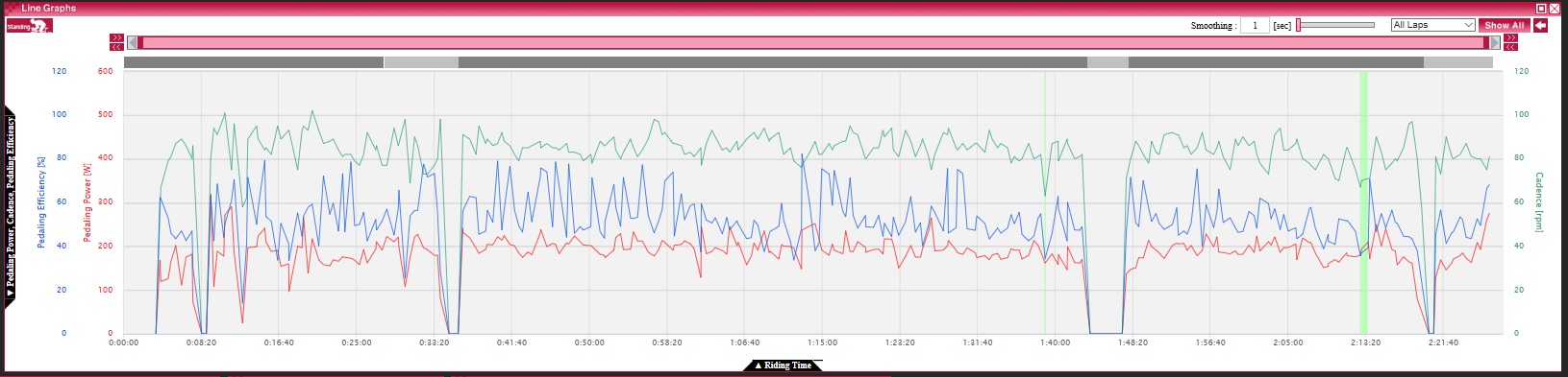
Getting back to the Mt.Fuji ride, the complete ride was about 2 hours uphill at a comfortable pace of between 3.0 and 3.5W/kg, with stops at a traffic light, the toll booth, then stopping to add a long sleeved shirt after gaining about 1000m in altitude and a brief rest before the final incline. The light green section is what the power meter noticed to be standing pedaling. There is usually more detail that becomes apparent only if you zoom.

Climbing up Mt.Fuji

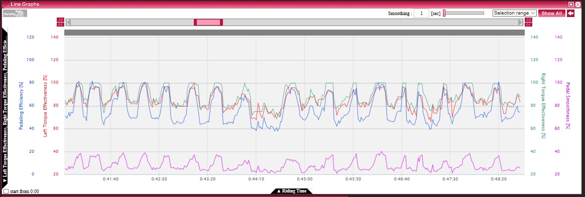
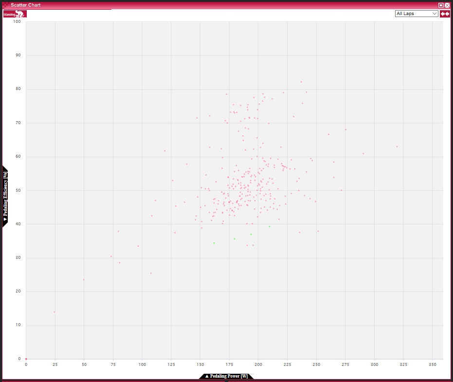
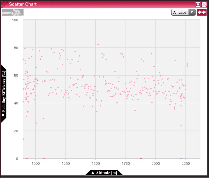
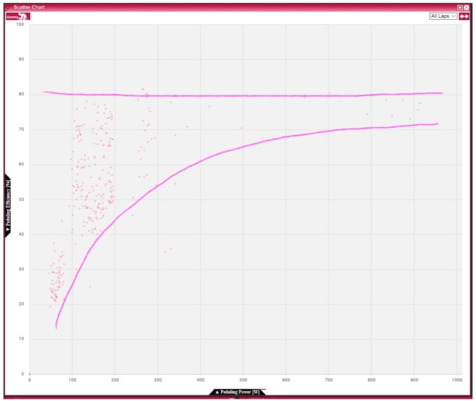
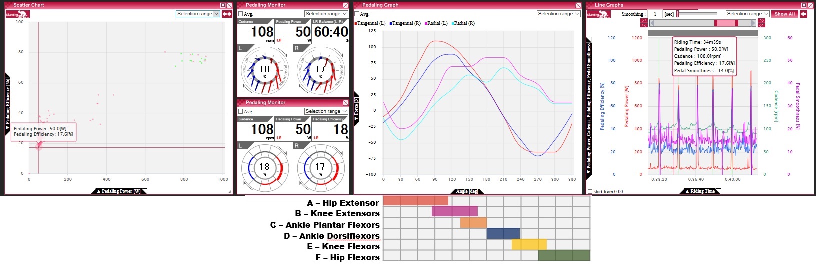
The following scatter plot of pedaling efficiency against power shows where most of my pedaling was: I rode mainly between 150W and 225W in power – a comfortable endurance pace centered around 75% FTP – and 40% to 60% in pedaling efficiency. What we learn is that some points including standing pedaling (in green) are below 40% and some go as high as 80%.

Pedaling efficiency vs Power (Mt.Fuji, whole ride)

For this ride which went practically uphill all the time, the following efficiency vs altitude scatterplot shows how efficiency changed over time. We see a decrease in efficiency but which is probably small enough to be negligible.

Efficiency vs altitude (Note: this ride was uphill throughout)

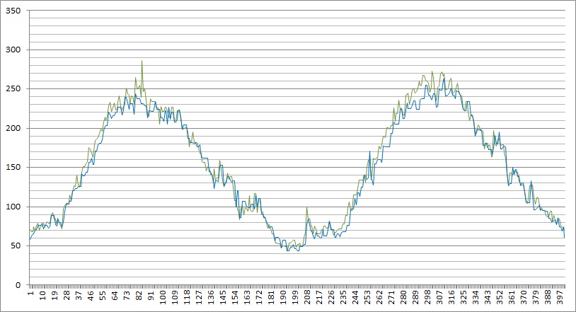
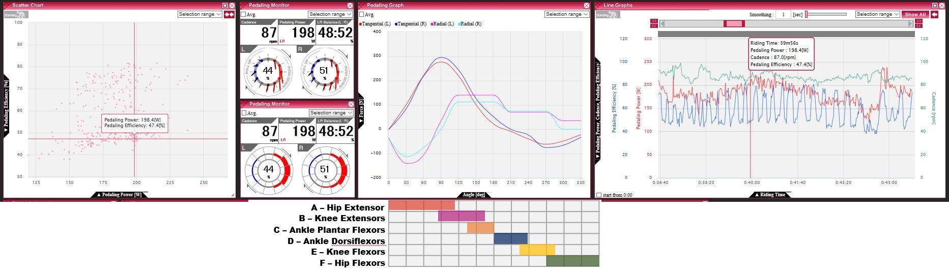
If we drill down into details, you will notice that an interesting characteristic of my pedaling is that I alternate in about 20 second cycles (almost unconsciously) between downward-focused pedaling at around 50% efficiency and a more circular pedaling style at around 80% efficiency.

Circular pedaling (sitting) @ FTP
Downward pedaling (sitting) @ FTP

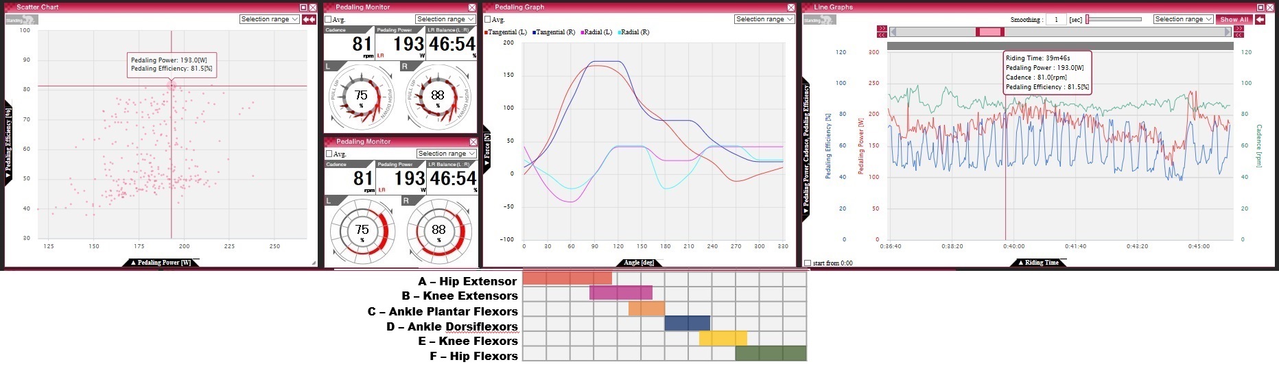
I believe I’ve had this custom for quite a long time. I have no information about how common such pedaling is. It’s somewhat comparable to alternating between sitting and standing to switch muscles used and avoid fatiguing the same ones. It doesn’t have to be a bad thing, but I seeing this fact, I wonder whether to not care about this or attempt finding a middle path between the two styles or increase the time spend in one or the other for example to increase overall efficiency or to reduce overworking my calves which tend to cramp in long rides. I’ve added a rough visualization (below the tangential/radial pedaling force vs crank angle graph) showing which muscles are used at each crank angle in the hope of noticing something but couldn’t make anything of it yet. I probably need to record activation of specific muscles using EMG sync’ed to crank angle to identify how I am using which muscles in either of these pedaling styles. Alternatively I could use SmO2 sensors (which I have already and which I needn’t sync with crank angle) to quantify muscle from O2 levels. We’ll see if I can get the data collected sometime during the winter.

Another observation would be that the slight imbalance in power towards right leg also coincides with higher efficiency on the right, and also that left and right look similar for downward pedaling on the force vs crank angle diagram but there is a significant imbalance for circular pedaling in tangential force between 6 and 12 o’clock and around 3, 6 and 11 o’clock for radial force.

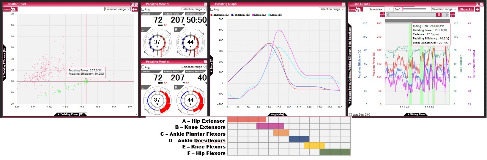
For standing pedaling at similar power, the efficiency is significantly lower at around 40%, with peaks of tangential power occuring later at around 4 and 5 o’clock as more body mass rests on the legs and is used to push the pedals downwards. It’s somewhat interesting that there is less left-right imbalance in power but there is a significant difference in radial force at 6 o’clock, where it seems that I am less able to pull my body weight off my left pedals. Reasons for this could be that I am less dexterous with my left leg or that I am actually using more of my body weight when pushing down the left pedals to cover less muscular force.

Downward pedaling (Standing) @ FTP

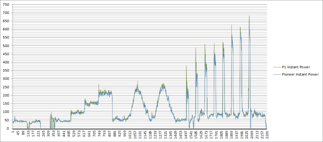
So much from the Mt.Fuji data set. To complete the picture with high and low power data, the following data is from an indoor ride.

The efficiency vs power scatter plot now covers the whole range of my cycling power up to about 900W or 16W/kg and we see more easily that higher power generally conincides with higher efficiency and that I saturate at about 80% (for all wattages).

Pedaling efficiency vs power

First, let’s look at a high power sample at about 400% FTP or 14W/kg. Compared with the previous sample of standing pedaling, efficiency is much higher at above 70% compared with about 40%. Left and right leg have to counteract to put down this much force and which naturally leads to more circular pedaling.

Circular pedaling (standing) @ 14W/kg

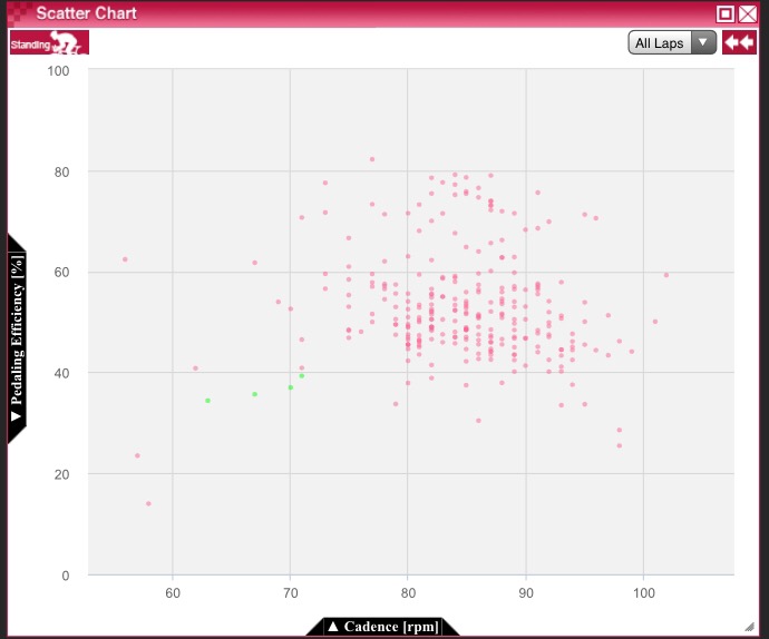
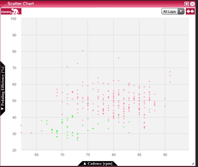
Cadence is lower than my usual 80 to 90rpm when sitting and similar to the previous sample at FTP. Does this affect efficiency? For sitting, efficiency does not seem to be affected by cadence.

Efficiency vs Cadence, whole Mt.Fuji ride

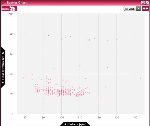
How about standing though? There I see two extremes – low efficiency at low power/cadence and high efficiency at high power/cadence but nothing in between. This might or might not indicate potential for improvement and makes me realize that I haven’t done standing high cadence drills for quite some time.

Efficiency vs Cadence, short high power intervals, green dots are standing
Efficiency vs Cadence, endurance ride, green dots are standing

Also note that I had about 2.5kgs of wind jackets etc in my waist bag which made me aware of up-down motion of my waist. I consciously attempted to avoid up-down bouncing of that bag and felt that the overall impact on pedaling was positive. I probably should compare pedaling data with and without that weight to find out.

Finally a low power example at about 50% FTP. It is quite difficult to perfect motion at such low power – not only for myself but also for others. But that shouldn’t mean that it’s a necessity and I wonder if that can be overcome with better body awareness and control.

Uncontrolled pedaling @ 50% FTP

All the above was mostly on the hoods, and a complete analysis should look at pedaling in the drops and in aero bars separately from this. I actually noticed an imbalance in the range of motion of my legs when riding my TT bike, which led me to choose short 150mm cranks to stay inside the range of my left legs. (Unluckily there is no 150mm version of the Pioneer power meter.) I learned afterwards that range of motion can be increased by training, so it would be interesting to see if that would not just benefit aero position but also resolve some part of the imbalance in left and right efficiency on a road bike.

Thanks for reading. Could have missed something or misinterpreted, so would appreciate any thoughts.

A few thoughts on choosing power meters

When I bought my first power meter – a Power2max, later renamed “classic” to distinguish from subsequent models – some four years ago, I mainly depended on DC Rainmaker’s blog to guide my choice. In the days since, I have tried five more power meters – a Pioneer, two Power2max (S and NG), Vector 2 and P1 – out of engineering interest. The first one now has been retired because of unexplainable spikes that appear only outside when going downhill, but on the way, I learned a few things that are not often mentioned.

Accuracy and Precision

I’ve written about this in some other posts already so I will spare the details here and just summarize: While most manufacturers make some accuracy claims about their products, there is currently no standard about how accuracy is measured. This means that a statement like “within 2%” doesn’t say more than there was at least one testing condition under which it showed less than 2% error in comparison to some reference about which we don’t know much. and isn’t comparable between manufacturers. No manufacturer I know makes statements about the delay of its power meters and crit racers seem to complain when they accidentally switched to a power meter with more delay than their previous one. If the “delay” is same for power in- and decreases it wouldn’t change the overall data, but often those characteristics differ and together with some built-in averaging short bursts can get swallowed.

When comparing power meters, graphing them separately on a power vs time graph of averaged power only allows for rough visual checking, meaning that you’d notice only if it’s really far off – and it can be difficult to spot trends. Using a peak power graph doesn’t make a scientific comparison either – it will show how much a peak power graph will be off but not much more.

A scatter plot graphing the output of one power meter against that of another is slightly more scientific as it makes spotting trends easier although you need to be aware of the fact that the sampling isn’t synchronized so the dots won’t line up perfectly – still how they distribute can give some hints about the behavior of each meter. If you draw a trend line for all dots and that line has an angle of 45 degrees, you know that both meters are accurate relative to each other. If the line is more like a curve, you know that at least one of them is not really responding linearly to your power. If all dots are very close to the trend line, both meters have high precision (i.e. small random noise) and a similar delay. If really a lot of the data points are far from the trend line, it’s probably not just a sync issue or a delay issue but really noise in the data of at least one of the compared meters.  A (cumulative) histogram of the power difference between two meter can also tell more about the meters than a time sequence comparison.

A potential problem with left/right separate meters is that their left and right gauges cannot be calibrated against each other, so there may be a bias in the reported balance that goes unnoticed. A combined meter that reports pseudo balance based on down- and upstroke cannot report the true balance but does not suffer from separate calibration; on the other hand, a biased sensor for crank position could be, though less likely, a problem. Ideally one would combine separate and combined strain gauges and calibrate the three sensors continuously against each other.

The ANT+ power meter protocols – there are many depending on power meter type (i.e. mainly location) complicating things – allows for sending data multiple times per second and SRM used to utilize this in both their power meters and head units, but recently they seem to have dialed back on this feature. More frequent data points may help getting a more accurate picture of short bursts.

You will probably use several different power meters over your lifetime and sometimes you will want to look at long term trends, so, while some argue that precision (meaning little random noise) is more important than accuracy (the average having no bias from true value), I think that’s only half the truth. A power meter really should be both precise and accurate. But by how much?

In my experience, over the long term, the difference between my power meters falls within 2%, but for single rides the difference could be 5%, or in rare cases even 10%. That’s a lot. So, don’t believe or depend too much on either precision nor accuracy nor (lack of) latency.

Calibration

In rotational systems, power is calculated as the product of torqueτ and angular velocity ω. Both vary over a crank rotation and need to be measure multiple times. Angular velocity is commonly sensed using acceleration sensors and an optional magnet to improve accuracy. Torque is sensed by strain gauges that measure the length of the underlying material. That length changes due to thermal expansion and applied forces.

The first calibration step is a zero reset, i.e. determining the readout of the strain gauges without any applied weight at the current temperature and deals with thermal expansion. This is usually enough for day-to-day calibration.

To be complete, zero reset should be followed once in a while by checking how the material reacts to applied forces. Due to structural changes in the material – for example metal fatigue in crank arms – and chemical changes in the glue that attaches the strain gauges or some errors during production that affect long term durability, this might change from what was measured and stored in the power meter during factory calibration.

A few power meters (like SRM, Garmin and Pioneer) can display on their respective head units either the currently measured torque or force. This means that you can hang your own static, calibrated weights to check accuracy and then store a linear correction parameter if necessary. This is generally good, but depending on the characteristics of the inaccuracy, a single linear factor might for example undercorrect for some power ranges while overcorrect for others and not be sufficient to correct completely. If the power meter/head unit does not support this, the best you can do is comparing with another simultaneously mounted power meter and on suspicision sent in to the manufacturer, but that means you won’t have your power meter for a few weeks every few years.

Temperatures may change during a ride. One approach is to trigger automatic zero resets in moments where there is no force applied. Obviously this can go wrong if the power meter misjudges whether or not there is force. The other approach is to have a built-in temperature sensor and a look-up table so that it learns over time what the zero reset values for any temperature should be so that it can choose values from the look-up table.

Advanced metrics

While some won’t stop noting that advanced metrics haven’t been proven scientifically to benefit cycling performance or only in rehabilitation after some injuries, it’s mainly a question of which metric, what purpose and the capabilities of the user in utilizing the data. If you love trusting and doing what your coach or some book tells you and trust your LBS or fitter with finding the best position for you, then you might not need any of this.

But if you are scientifically minded and think that just using your body and not your brain defeats the purpose of being alive, don’t let yourself be discouraged from choosing a power meter that will give you more data, though of course you have to decide which data you want/need.

The Pioneer pedaling monitors can record and visualize not only tangential force but also radial force though only on their own head units and support some interesting visualizations on their cyclosphere portal. This is somewhat similar to what some bike fitters use and can be really useful when optimizing your position on your bike. Unluckily exporting that data into other formats for your own analyses is not supported.

The torque efficiency supported by left/right separate power meters like the Vector and P1 pedals and the Pioneer in ANT+ compatibility mode has been useful for me as well, while the power phases of the Vector and pedaling smoothness less so.

P1 supports some potentially useful graphical visualizations on their iOS app but the readability and post-ride analysis support leaves a lot to desire at this moment, although it seems they are still working on this.

Torque efficiency can usefully be measured on a left/right separate system. The spider-based Power2max NG reports a combined torque efficiency which I haven’t figured out yet how to use.

Verve and Rotor could be worth looking into but require PC’s for real time analysis and, I believe, recording.

Single leg drills

The P1 didn’t work when pedaling right only as their left pedal which sends out the combined ANT data used to power down. In my most recent ride I noticed it seems to report power to a Garmin Edge during right only drills though cadence disappeared.

Sitting vs standing

The Vector and the Pioneer can differentiate between sitting and standing pedaling when combined with their respective head units. (I still need to check whether that works on a turbo trainer as well.)

Location

There are some conceptual and usability differences depending on the location of power meters. A spider, crank or pedal-based system can be less accurate at low cadences, while a hub-based system can be less accurate – I thing, but I might be wrong with this – at slow wheel rotations. If you are only interested in tangential forces, the Rotor in-power left side crank with strain gauges in the BB axis is possibly the best location for the left side, followed by spider and hubs for combined measurement. Pedals are a difficult location to engineer well, and cranks can be difficult if not designed specifically for power metering as with Verve cycling’s Infocranks. More obvious is the difference in measuring before power train loss (using spider, crank or pedal-based meters) or after (using hubs) – and the power train loss can be significant.

Maintenance

A crank or spider is naturally maintenance free except for checking and if necessary calibrating long term changes over several years. The Vector pedals can be serviced by the user to the point of swapping the internals into Ultegra pedals using their optional kit.

The Powertap pedals and hubs needs servicing to be done at the manufacturer – especially the pedals are a really complicated construction. Pedals are never maintenance free, so you should think twice before getting some that need to be send back for maintenance or at least include fees (the pedals have a two year warranty except for the bearings which are covered only fir six month) and downtime in your cost projection. The issue then is that they don’t have a clear maintenance cost table (yet).

Waterproofing

Waterproofing can be an acute issue in heavy rain and a corrosive issue over the long term. Ideally you’d have a hermetically sealed system with inductive charging and wireless firmware updates. Unluckily, that’s not available (yet) so we have to live with compromises.

Some users seem to have problems with the P1 acutely in heavy rain and with humidity over the long run; I myself have occasionally noticed condensation in the battery compartment. (Note to P1 fanboys: No, I have never done a battery change in the rain.) The contact between the Vector pods and pedals could potentially be an acute issue in heavy rain. Same with the design of the rubber band sealing on the battery compartment of the classic and type S Power2max meters though I believe their electronics is sealed. Their newest “NG” charges over USB and the rubber cap is flimsy but I believe the USB port itself is water proof – although USB ports are known to corrode over time if kept wet.

Robustness

The Vector pods are a potential liability, not just off-road but also when transporting the bike and I really wish for some design changes. The Pioneer magnets (which are not simple magnets but a less common design and required in pedaling monitor mode) can be stripped from the frame when the chain drops – and stick to the chain as I experienced. If you don’t notice that when fixing the chain, I imagine it might play badly with your rear derailleur when you continue riding.


Calibrating Power Meters with known weights

It’s often said that for day-to-day training, the important property of a power meter is precision (i.e. repeatability of measured values) and not absolute accuracy (i.e. correct value). I do agree but … what if you had several bikes with power meters fitted to each (okay, that’s actually another reason to swap a hub- or pedal-based power meter!) or wanted to review your long term performance changes 10 years from now?

Some power meters allow to check their absolute measurements after doing a zero-reset (example: Pioneer displays force in [N]), some even allow you to specify a scaling parameter after checking (example: Vector displays torque in [Nm] and allows to store a scaling factor in the pedal to correct their output). Some, like the older P2Ms, unluckily don’t do any of this.

Garmin has a manual on the internet for the recommended procedure. Although they mention the difficulty of measuring a heavy weight of over 10 kgs to the required precision, in their example they are using a large weight, and hanging that from a pedal requires hanging the bicycle high up in the air while attaching the weight … nothing I’d be keen to try.

One alternative could be to just use a calibrated weight that’s used for checking scales, which looks like this:

power meter calibration weight 2This one here is a 10 kg weight (which I admit is a bit on the light side, even as a light weight cyclist with a not too high maximum power number; 10 kg is equivalent to between 150 and 200 W at cadence 100 for ideal completely round pedaling or probably about 50 W at cadence 70 for typical not-round pedaling) accurate to plus minus 1.6g (guaranteed for one year by the manufacturer), which is far above the accuracy needed for this procedure. A 20 kg weight would only measure about 25% more in height/width/depth each and still be compact enough to measure both tangential force (as seen in the picture with a horizontal crank) or radial force (with the crank in upward position) with the wheels on the floor.

Together with the metal hardware like shackles to mount the weight to the pedal, measured on a extra precise kitchen scale, the total weight was 10184.5g plus minus 2.2g or 0.02% accuracy. With power being linear to force and torque, that’s more than accurate enough. (Sorry for the blurry smartphone picture.)

power meter calibration weight - small hardware on kitchen scale

My results for Vector2: Expected 16.485Nm (for crank length 165mm), measured 16.81Nm on right and 16.44Nm on left.

My results for Pioneer: Expected 99.91N, measured tangential 102N / radial -102N on right and 98N / -102N on left.

In both cases, that’s about 2%, which means that without any other error, the final power values could be within 2% error.

Thoughts:

The big question here is of course: even a slight cadence error of 1 rpm will set this off largely, so a 2% error of the final power value is actually unlikely.

I might better use not just a heavier weight, but actually several different weights.

DCRainmaker reported that the yet to come Watteam Powerbeat will use a plastic bag that fills with an exact amount of water to act like a accurate weight. If that works, that’d be nice, although, hanging like 10 kgs = 10 liters doesn’t seem very practical.

Somewhat related: Wahoo used to sell, and probably now rents a weight for calibrating the power meter inside their KICKR trainer whereas Tacx claims their new really direct drive trainer is calibration-free. (The KICKR was only half direct between chain and trainer, but still had a belt driving a flywheel, while the new Tacx is doesn’t really have a flywheel and is completely electronic producing a virtual feeling of inertia by electronic control.) The principle behind the Tacx I guess is that calibration is not necessary if you can control or measure electric current very accurately. A more simplicistic view could be: for a rotation sensor you’d either have a magnet switch or some self-calibration using accelerometers and gravitational force, so why having to calibrate a power meter, isn’t that just poor engineering?

Comparing responsiveness of Power Meters

Note (May 2018): I should probably re-collect, re-analyze and re-write this to reflect what I learned about the ANT+ power meter protocol and through programming for ConnectIQ. Looking at the data now, the agreement between instant and average power of the P1 seems to indicate that it simply had zero drops – whereas the others had much more. Wished the WASP would record drop rate … or I might add that to my CIQ datafields.


One issue I see with power meters – when you go beyond just using it for day-to-day training and start to compare the data with that from other power meters or over a longer time period – is that although most manufacturers give some number about the accuracy of their devices, usually in the 2-3% range, they really give you just that single number.

Given that it is difficult to engineer – sorry, I won’t explain this deeper at this moment – a power meter that is accurate at very low power, at very high power, for quick changes, and over a long time period, that single number is not at all useful. Neither for comparing different power meters when shopping nor as a guideline about how much you can trust your data.

I will write at some other time about other accuracy issues; in this post I will briefly compare Pioneer’s second generation (crank-based), Garmin’s Vector2 and PowerTap’s P1 (both pedal-based) about how they respond to changes in power, or, in other words, their delay time from measurement to output. Although I do have a background in engineering and science, these are just simple tests of single devices bought through common sales channels, so I don’t claim that this data is in any way representative: It’s just what I got when I rode some time. (Note: Unluckily I am lacking a hub-based power meter, which would really be nice to have for such a comparison. I still need to check how useful the power data from the KICKR are: I know that their power data isn’t that accurate as I’d like but they could still be helpful if their sampling rate is high enough.)

First up, Pioneer in ANT+ mode versus Vector2, recorded using North Pole Engineering’s WASP unit (note: this allows me to record synchronized at a 1 sec resolution without relying on any specific head unit) on a KICKR (note: I used TrainerRoad to design a ride including constant sections at different power levels, ramp-up and downs, as well as 15 sec spurts at different power levels. The KICKR was controlled from TrainerRoad with PowerMeter feedback from the Pioneer in automatic mode). These are one-to-one comparisons, so there is no way to know which if any of them is right. In most cases, both have delays and both data have some error.

When looking at the whole ride, the power numbers seem to match more or less:20150808 Vector2 vs Pioneer allIf one starts looking at the details, it seems that the Pioneer is slower to respond to ramp ups than the Vector2. Interestingly, this hold only for the up-ramp and not for the down side:

20150808 Vector2 vs Pioneer rampWhen looking at 15 second sprints, the delay seems negligible but the maximum power numbers are lower for the Pioneer:

20150808 Vector2 vs Pioneer sprint

Next, comparison of Pioneer vs PowerTap P1. Again, no significant difference on a larger scale:

20150807 P1 vs Pioneer allAgain, we see that Pioneer has some delay on the up-ramps. The P1 might even be a bit faster to respond than the Vector2, but it also seems to have a bit more spikes.

20150807 P1 vs Pioneer rampHere, the first three sprints show that the P1 is more responsive than the Pioneer. Again, there is also a difference in maximum power values.

20150807 P1 vs Pioneer sprintA natural question now might be: What happens if someone does extremely short power bursts? It seems you can get away with 1 to 2 seconds of very brief bursts while the Pioneer is undecided whether that’s a burst or a noise spike. Although not noticable from the data alone: It seems that the Vector2 is slow to get down to zero and often didn’t go completely down as well, so, whereas the up-ramp of the Vector2 is more trustable than the Pioneer (which shows smaller than real power values because of it’s delay), the Vector2 may show inflated power values because of the delayed down step.

20150810 Vector2 vs Pioneer bursts(Section starting here added on August 11th)

Actually things are not that simple, for two reasons.

First, the ANT+ power meter protocol has to get power meters of fundamentally different designs like hub-based (where power is calculated from torque and wheel rpm) and crank-, spider- or pedal-based (where power is calculated from torque, cadence and, in the case of pedal-based meters, crank length) as well as head-units of different levels of sophistication (just displaying instant power, or being able to do calculations and recordings) under one roof. So the standard actucally includes different ways of communication. For example, in one such communication protocol, there is a data field for instant power, meant for simple displays, as well as accumulated power, from which you can either calculate average power (as the difference between current and last accumulated power; that’s I believe what the WASP does to calculate the average power data field) or correct accumulated statistics like TSS.

Second, current crank-, spider- and pedal-based meters all rely on a torque sensor and a basic physics formula that requires cadence to calculate power. (That’s also the issue with oval rings which kills the assumption of a constant cadence.) For these kinds of short bursts, even using accelerometers instead of a simple magnet that only triggers once for every crank rotation, it may be difficult to sense cadence accurately. (If they did, they’d all be able to provide correct data for oval rings, too.) So, these short bursts are likely outside of the not-published working conditions of these power meters. (Even Verve cycling which gives more information about working conditions than the other manufacturers doesn’t say how responsive their cadence data would be in such a condition.)

So, with this knowledge and including all relevant data, the above graph looks like this:

20150810 Vector2 vs Pioneer bursts with average power filled with cadenceAlthough not visible from the data alone (if you trust me with this), I had stopped pedaling between the bursts, so, cadence data from both units are messed up, meaning that all the power data doesn’t look trustworthy to me (unless they are internally calculating with some other cadence data that they don’t send over ANT+). On the good side, Vector’s average power data seems to avoid the effect of sticking to high power values even after the burst has ended that I observed with their instant power data and on the Garmin Edge display. (Actually, they might have designed instant power this way so that you don’t miss data when briefly looking at your computer during a ride.)

Now, when we compare the Pioneer in its proprietary pedaling-monitor mode, we get this:

20150811 Vector2 vs Pioneer in pedaling monitor modeIn pedaling-monitor mode, the Pioneer’s data cannot be recorded with the WASP, so I had to export from Cyclo-Sphere and convert the .fit file to .csv using GoldenCheetah, and manually align them as good as possible (note: a perfect alignment is not possible with devices that are not synchronized).

Now, the interesting thing here is that the Pioneer’s cadence data from Cyclo-Sphere looks much better than the one I got via ANT+, probably also contributing to power data that is closer to data from the Vector, although still lower, and there is not much of a delay compared with Vector.

Since I’d gotten myself already knee-deep into this, I also briefly swapped pedals and compared Pioneer in ANT+ mode with PowerTap’s P1.

20150811 P1 vs Pioneer corrected colorsA few interesting observations: The P1 does not distinguish between instant and average power in the ANT+ protocol – I don’t actually know what the intention was for creating a protocol that allows separate numbers for them. The length of the bursts in the P1 data seems correct too, although I don’t have any data to back that up. On the other hand, the Pioneer seems to distinguish between cadence data available via Cyclo-Sphere and the “instant” cadence data from their ANT+ stream, possibly resulting in their Cyclo-Sphere power data to be more likely than the power data from their ANT+ stream.

Follow-up (August 15th):

Here is a set of Vector2 vs Power2Max comparison data. Slightly different setup, with data set taken on a roller and not the KICKR.20150815 bursts p2m vs vectorObservations: Genereally there is quite some difference between Vector and P2M. Between 21s and 60s I did some single crank rotations, which are much better picked up by the P2M. For two and more crank rotations, there is more agreement between the two in both start timing and power value, but vector seems to take longer to notice stops. P2M does not distinguish between instant and average power, while vector again has some larger differences between them.

Conclusion (revised on August 11th):

For normal riding, all three power meters seem pretty much good enough to me.

If anyone wants correct data for very short bursts, there is a fundamental limitation here: A crank- or pedal-based power meter depends on how exact it can measure cadence during such a brief burst, and even using accelerometers or mounting the cadence magnet to utilize polarization change for higher accuracy when sensing crank position.

So, my recommendation would be, to either try a hub-based power meter (although I admit I’ve never used one before and have no idea how they’d perform under such conditions) or go with the P1 (which seems to provide honest data, an impression that also somewhat aligns with their claim of using a large number of sensors (8) and enough computation power).

Personally, I highly value the realtime pedaling analysis data that the Pioneer power meter gives when combined with their head unit, which can be helpful for understanding and changing pedaling technique (whereas I personally found the advanced metrics of the Vector and Garmin’s visualization on the newer Edge units less useful, but that might be just myself). Therefore, as a total package, I’d still thing that the Pioneer will have the most impact on someone’s cycling performance although only in combination with their head unit and if you ride regularly indoors and are concerned about pedaling technique. (Yes, choices are never easy.) And, if you really need data from bursts using Pioneer, may be look at Cyclo-Sphere data and not their ANT+ stream.

A common way to reduce noise is to use something called a Kalman filter or to do at least some simple averaging; both necessarily delays the data output. It seems the Pioneer has been engineered more towards reducing erroneous spikes than the Vector2 and the P1, or it’s simply looking at a longer time window given that it was fundamentally designed as a pedaling monitor and averages less over crank rotation.

Other thoughts:

The general consensus in cycling data collection to use 1 second sampling seems old, considering how much communication bandwidth and memory capacity is nowadays available and that most power meters are actually sending at a higher rate. A higher rate could simplify simultaneous correct recording and undelayed display under all conditions including quick bursts.

But even at 1Hz, one should expect “instant power” to be instant possibly including spikes and “average power” to give correct data when accumulated over time. Power meter manufacturers should make clear what their specific conditions for accuracy are.

If I was to design a power meter from ground up, I’d possibly integrate a high resolution optical rotational encoder in the bottom bracket that together with accelerometers would enable giving exact rotational position and velocity, solving both oval ring issues as well as accuracy under bursts.

The comparison was also restriced by the WASP iOS app to be able to record only at 1Hz and not all the data that the power meters are sending, which would have allowed for more exact assessments of delay time. I was not able to check yet whether the WASP’s ANT+ to WIFI bridge functionality filters down to 1Hz (I need to sign their NDA first!) or whether it is a restriction of their iOS app. I was neither able to find a PC or Mac application for simply recording all ANT+ traffic.

The processing involved here is possibly somewhat comparable to high ISO noise reduction in digital cameras which reduces noise patterns but also image details. It might be good if power meter manufacturers made these noise reduction levels user-configurable as in higher-end digital cameras, empowering the user to choose the processing that is best for their usage.

List: Sensors (June 2015)

Data is the starting point of every analysis. Here’s a list of sensors I am currently using.

Power meters:

-Power2Max (first gen. after minor change): very basic, reliable, quick reaction to intensity changes. Spider-type.

-Pioneer (second gen.): pedaling technique visualization (useful especially indoors, less so on the road). Crank-type.

-Garmin Vector 2: some advanced metrics (though of doubtful value during ride). Pedal-type with pod.

-PowerTap P1 (ordered): pedal-type.

Biometric sensors:

-SmO2: Moxy: NIRS sensor giving raw data of (remaining) O2 saturation in blood flow of muscles. Currently the only sensor for home use to actually show what’s going on in the specific muscles, although it is still a somewhat indirect measure that requires interpretation. Potential to show you how to warm up most effectively, what systems your weak points are, whether you are really at your limit, etc. Learned for example that my left and right legs are so completely different even when riding at a 50% to 50% balance. Possibly revolutionary to training.

-HR: Garmin (chest, ANT+), 4iiii (chest, ANT+ and BT), Mio (arm, ANT+ and BT).

-LT: BSX insight: was only able to do few rides so far: I do not seem to be the only one with connection issues. Concept of measuring LT might not be the holy grail anymore when you can now have SmO2 data instead.

Data collection:

-NorthPoleEngineering WASP-B with iOS app.