Races are not my thing. I wouldn’t exclude the possibility that some time in the future I might change my mind and start participating in races – not that I am a believer in the stupid “never say never” movement, just open to changing my mind if given new evidence – but at this moment I’d categorize even a more deterministic competition like time trialling to be effected too much by random circumstances to make it worthwhile spending any time on it. Not that I’d be so naive to think that hard work should be always be rewarded. It’s more that I’ve never been happy winning something by luck.
How then to compete, not just with yesterdays self, but with others, beyond reaching for the occasional KOM or Sprint jersey in Zwift while training? How would I judge my strengths and weaknesses compared to other cyclists?
Answer: By power data statistics.
- Cycling analytics (http://cyclinganalytics.com)
Cycling analytics allows to overlay the peak power distribution of all cycling analytics users (of same gender) to your peak power graph, which looks like this:
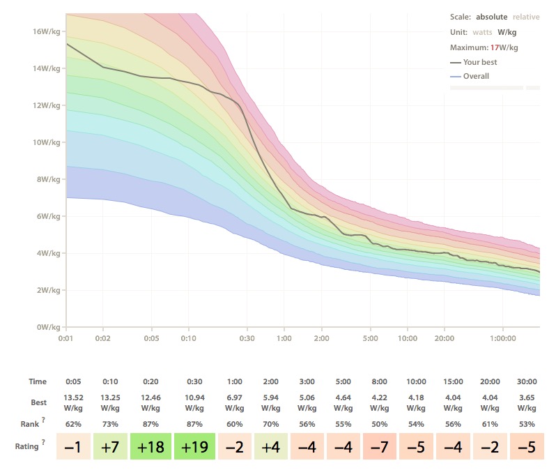 The rainbow colors represent the distribution of other riders and the gray line the own performance level, where higher on the vertical axis means better. What we see here is that, if we look at power weight ratio, I am generally pretty much average or slightly above, with a strength in short intervals from 10 seconds to up to 2 minutes. The “Rank” is the rank within the distribution where 0% is bottom, 50% median and 100% is top; my rank ranges from exactly 50% (i.e. pretty average) for 8 minute intervals to 87% (i.e. almost-not-able-to-improve-much good) for 20 and 30 seconds. So, from this data it seems clear that there is plenty potential to improve my endurance whereas trying to improve on short intervals might not lead to much further improvement. Or, if I’d start racing (and wanted to be successful), I might want to find a competition where short sprints are relevant. The colored, bottom-most “Rating” is a score for the riders relative strength/weakness when comparing different interval lengths not across population but within the rider.
Cyclinganalytics is free for one time analysis but requires a small monthly fee if you want to store and accumulate data.
- Cyclo-Sphere (http://cyclo-sphere.com)
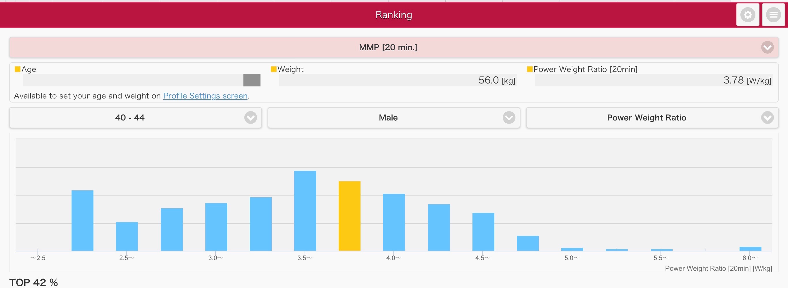
Cyclo-Sphere recently added a “Ranking” function where you can compare 20 minute max average power (or MMP in short for I believe Mean Max Power in their terminology) and – if you are using the Pioneer power meter – pedaling efficiency. In it’s simplest form, it looks like this, which is essentially a vertical cut through the CyclingAnalytics graph at 20 min on the horizontal axis showing the actual sample size on the vertical axis, with the bar that includes me colored in yellow. Note that, here, the percentage ranking counts down from top (i.e. smaller = better), opposite to what CyclingAnalytics does. And in the bar graph, more right = better.
Further, we can select a scatter plot, keeping power weight ratio on the horizontal axis but replacing the vertical axis by Pedaling Efficiency and the size of the blue circles now representing the number of samples.
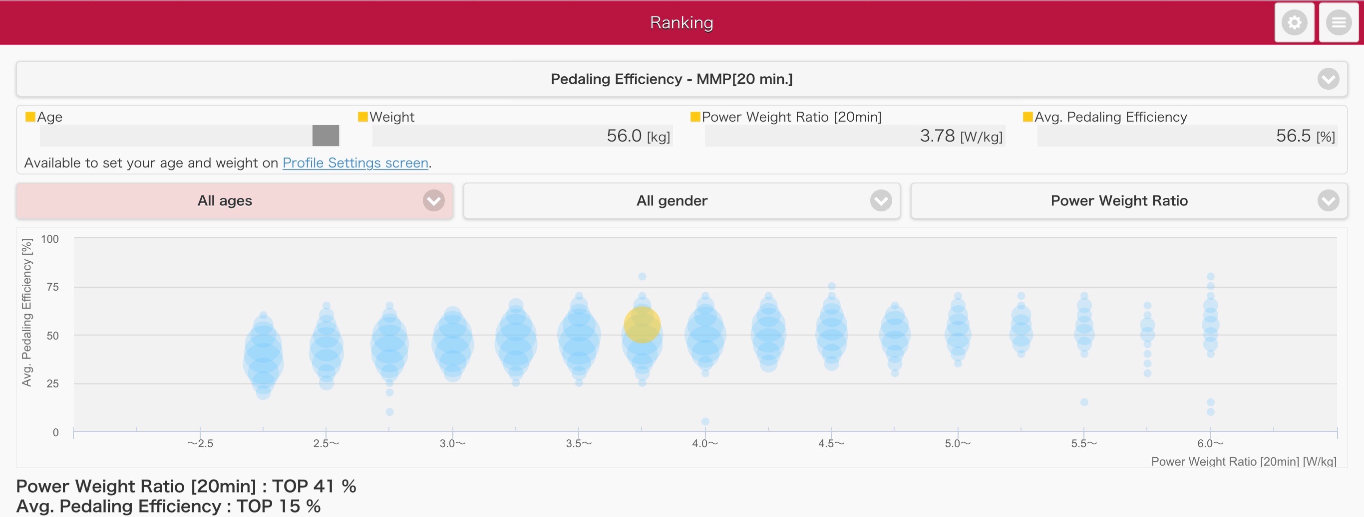
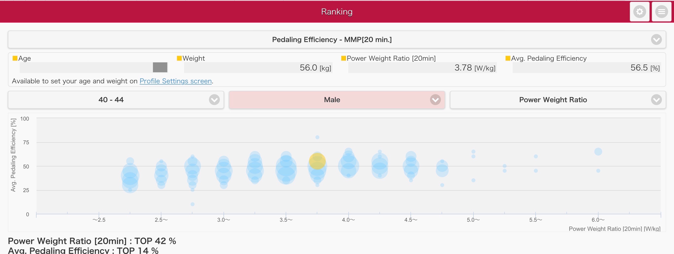
We can further narrow down by gender and age group. Obviously, there is a shift towards less power with increasing age, which seems natural. I am not sure whether the small change in ranking number at the bottom left of the graph really means something. I am actually surprised that the large visual difference in distribution only changes 1 percent in the ranking. If this is true, it would mean that performance of super powerful riders decreases with age but everyone else is not affected by age – which seems weird.
In summary, the Cyclo-Sphere data again shows that I am slightly better than average, with the 41% ranking (counted from top) in Cyclo-Sphere pretty much exactly matching the 61% ranking (counted from bottom) for 20 min intervals in Cyclinganalytics – which is super surprising and maybe a random coincidence, considering that the user base could be pretty different (or do large populations of cyclists converge to some representative distributions?). There is actually also a slight difference in data processing as the latter uses overall historical best whereas the former looks at recent performance, but at this moment I am at my historical best (at least for the period I have been collecting data), so that doesn’t matter here.
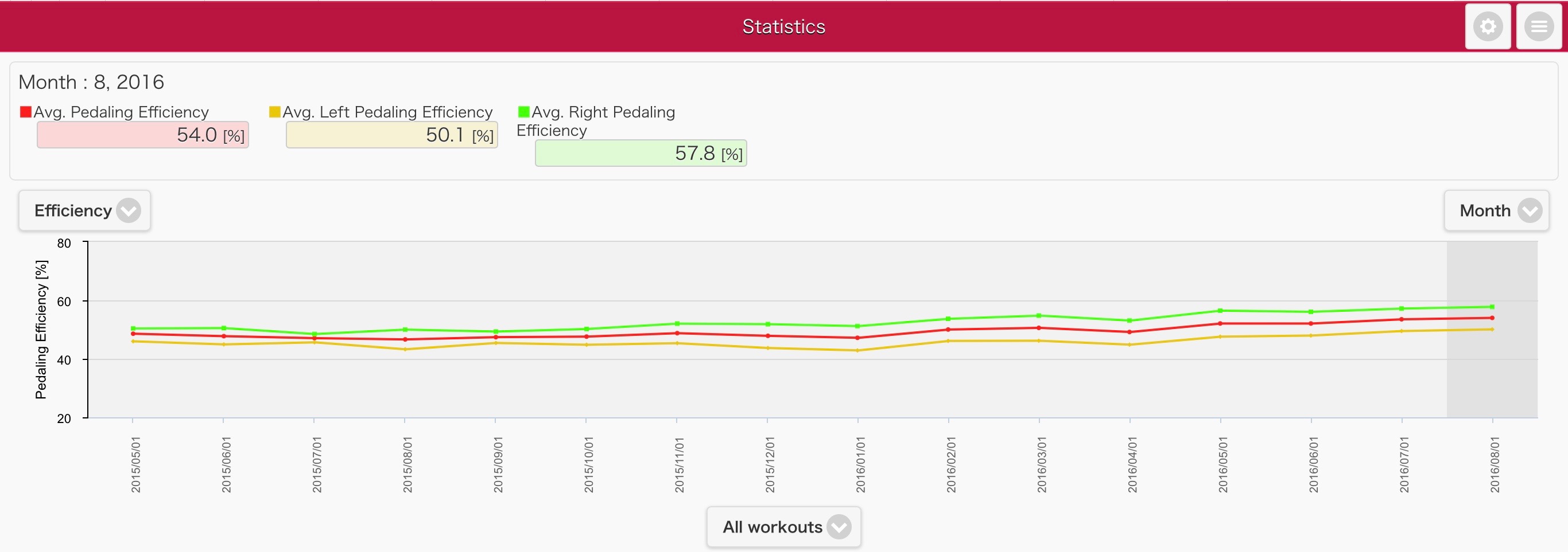
The Pioneer power meter is a rare one: Whereas most power meters measure only tangential force which is the factor contributing to power (or, more precisely, process the data to extract only the tangential force and throw everything else out), the Pioneer isolates both tangential and radial forces and calculates efficiency using both. This difference also continues with the efficiency metrics: The more common efficiency metric in Garmin Vectors and others represents efficiency of tangential forces only, i.e. it measures mainly the tendency to not pulling up your legs enough between 6pm and 12am and leaving an force opposite to the rotation on your pedals. So, one could score a 100% efficiency with a Garmin Vector even if you’d be stomping on your pedals with a not-contributing vertical force at the top or bottom dead point, whereas a 100% score with a Pioneer means ideal pedaling with zero such radial forces. So, my 56.5% efficiency measured by Pioneer seems low if compared to tangential efficiency which is often much higher, but is actually pretty good and within the top 15% according to Cyclo-Sphere.
If we look in more detail, shifting from statistical population data to personal ride history shown in the graph below, we see a small but continuous improvement of overall efficiency over the last two years, and, separating left and right efficiency, we see that I am not astonishingly but still noticeably better on the right than the left. This could mean potential for efficiency improvement on the left leg even if I cannot eliminate a possibly natural tendency to be stronger on the right. Although of course, a natural dexterity advantage of the right leg could mean that I will always be less efficient on my left leg, one thought is that my right leg is more flexible with a larger motion range, so, improving flexibility of my left leg could be worth attempting. An extremely rough calculation of 8% efficiency improvement of the left leg or 4% overall would mean potential for an increase in 20 min Power Weight Ratio of 3.78W/kg to 3.93W/kg. Not huge but significant and probably worth attempting.
Cyclo-Sphere is free to use for anyone. I haven’t checked whether it will use the efficiency data of other, non-Pioneer power meters.
And the future?
The statistics I am really interested in and what may become available in the near future, given the broader use of power meters which allow for data driven, objective comparison over time and between cyclists are:
- We are starting to learn that cyclists differ a lot in their response to training stimuli, and that standardized training, even if adopted by (single) measures like FTP, is somewhat of a lottery. It would therefore be extremely worthwhile to learn what “types” of training responses there are, to which type oneself belongs, and what kind of training is most effective over the long run or given time constraints.
- We’d start selecting between services like TrainerRoad and TrainingPeaks depending on objective data about how much their users are really improving.
- Training plans would not just be selected by the type of competition we are targeting and scaled by a single metric like FTP, but we’d have personalized custom training plans that combine the most effective training stimuli depending on an automated analysis of ones own and others performance data.
- This could then lead to statistics showing where someone stands within cyclists spending the same amount of time in the saddle. It’s good to be fast and just spending more time on the bike is not guarantee to be faster, but still, you’d somewhat expect someone with significantly more time spent cycling to be faster. A “handicap” for less training time would feel going to far, but a competition for most effective training could be interesting.