In statistics, precision refers to repeatability, meaning that something is precise if all measured values are close to each other, while accuracy is exactness, meaning that the average of all measured values is close to the correct value. So, a power meter can be accurate and precise (the ideal case), precise but not accurate (useful for day to day training, but not comparable with other meters), accurate but not precise (average values are correct, but a single sampled value can be far off), or neither accurate nor precise.
Obviously, an accurate and precise power meter would be nice to have, but it’s also pretty well known by now that power meter values can dance a lot, and many riders display 3 or 5 or even 10 second averages on their cycling computers.
So, how precise are power meters?
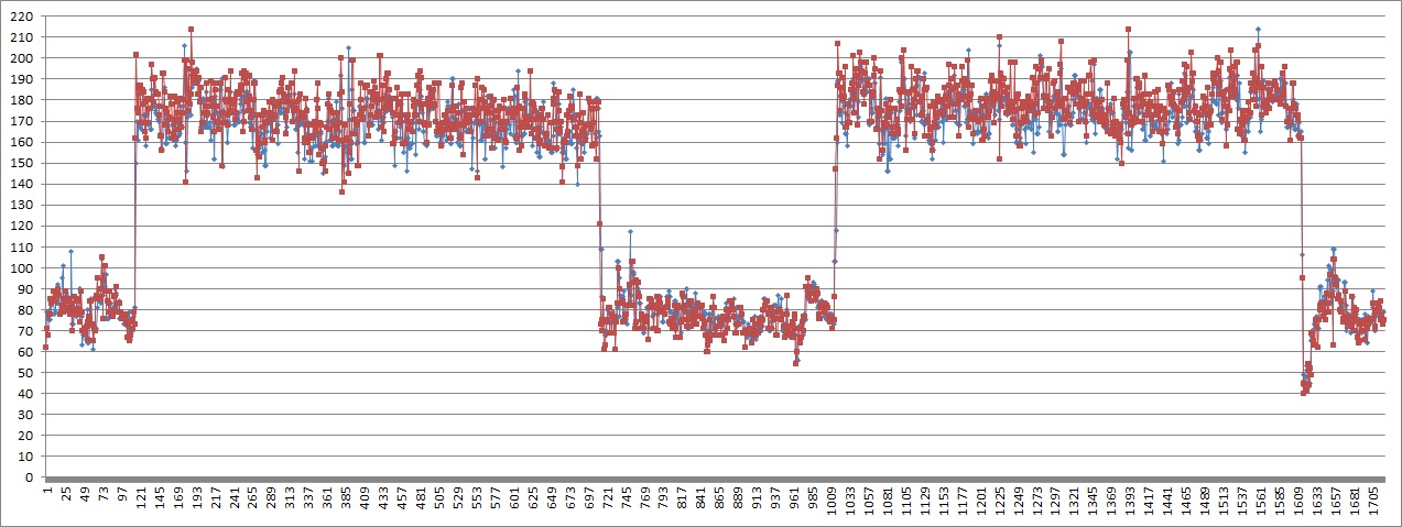
Let’s look at this ride, comparing Pioneer ang Garmin power meters. As usual, this is just a single one-to-one comparison ride, so, I am not saying this data is representative for power meters in general or these two power meter models in particular, it’s just what I got. And, if you’d ask me which one is correct, I’d of course say: neither one.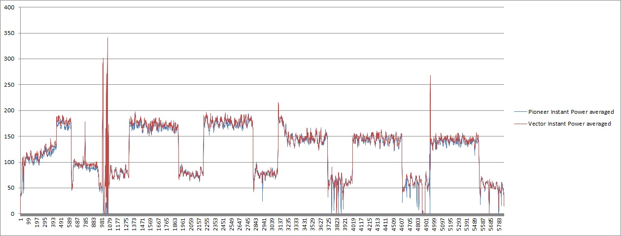
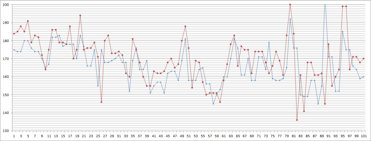
If we zoom in, we get something like this:
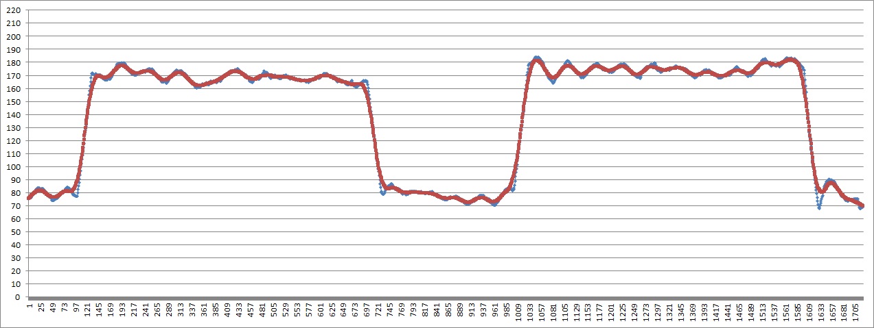
Large changes in power obviously correpond, but small changes look pretty chaotic. Averaging over, say, 30 seconds eliminates all small changes and we get this:
So, both meters follow each other pretty well, and the pioneer is a bit slower to respond to large changes, but then tries to correct itself by a steeper slope. (Overshoot is pretty well controlled, although we see one at the last decline.)
But, this isn’t really satisfying: If I buy a kitchen scale for which the manufacturer is stating an accuracy of plus minus 1g for any weight below 100g, I expect 95% of all measurements to fall within the stated error range. Aren’t we making it too easy for power meter manufacturers when we let them get away with a simple accuracy statement (that’s also difficult to check) without any promises about precision?
So, what can be done with data that looks like this:
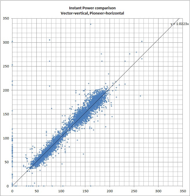
One thing to try is a scatter plot where every data point is visualized by a single plotted dot, here with Vector on the x-axis and Pioneer on the y-axis.
The dots on the left on the y-axis show that the pioneer has more zero values which might be caused by measurement or transmission errors. The linear approximate y=1.0223x shows that on average the vector output is about 2% higher than the pioneer. Of course, one has to be careful with these plots because different time delays and a non-symmetric ride profile could bias this data. On the other hand, if the relative delay time difference is constant, one could simply shift the data set and try out several delay time combinations to find the most likely delay time.
We also see that the blue dot’s don’t line up neatly on the linear approximate line, but create a blue belt about 20W in width …. that’s a lot. So, let’s look at the width of this distribution in more detail, just keep in mind that this is not the error histogram of a single power meter compared with a correct value, but the relative difference of two power meters, containing the error of both (including the possibility that they cancel each other out sometimes).
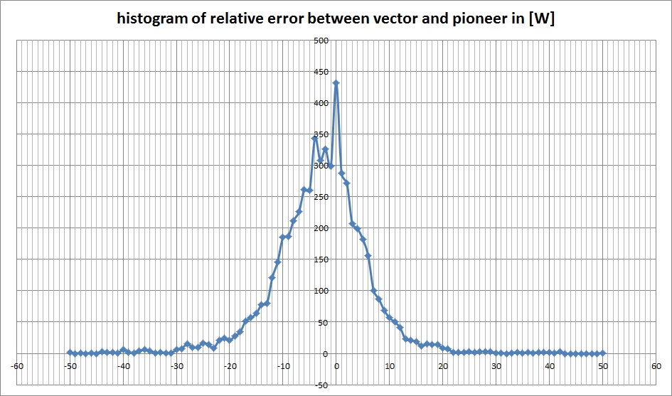
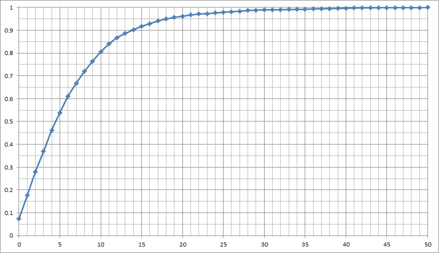
I am actually surprised that the peak comes at zero difference between the meters and a lot of values fall between plus minus 5W from zero. If we re-format this into a cumulative histogram, we get:
About 50% of the values fall within a plus minus 5W range, standard deviation is about 7W, 95% (or 2 s.d.) is about 18W and 99.7% (or 3 s.d.) is about 40W. So, from a statistical point of view, it’s pretty much nonsense to display instant power on your power meter.
I really think we need to have power meter manufacturers state how precise their meters are or have some independent organization check them with a calibrated pedaling robot.
